Friday, 28 June 2013

MacBook Pro with Retina display


macbook-pro-with-retina-display.jpg

When I was 13, I was sent to the optician for the first time, and came home with glasses. Suddenly, the world was sharp all around me. I was surprised by the crisp lines of the tree branches against the sky. It was news to me that I was near-sighted, because I had been used to seeing the world in a blur.Apple Inc. sells a similar epiphany, 
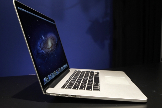
starting this week, in the shape of a notebook computer. One of its new MacBook Pro models has a "Retina" display, a screen that packs four times as many pixels as a standard display.
Why is this a big deal? It's not easy to describe in print, but a look at the screen tells the whole story. It's like putting on glasses and realizing you're nearsighted. Much like the screen on the latest iPad, the new display makes all other screens look dull and fuzzy.
Even the icons on the Mac screen look so much more detailed. On the calendar icon, you can make out the dots for the individual dates. On the Address book, you suddenly see that the "at" sign on the cover is embossed.
High-resolution photos look really, really sharp. Low-resolution photos, like those on Facebook, are revealed as mushy and indistinct.
With a resolution of 2,880 by 1,800 pixels, the Retina screen can show every pixel in a five-megapixel shot, all at once. It has more pixels than a high-definition TV set - 2.5 times as many.
As you might expect, this epiphany doesn't come cheap. The MacBook Pro with Retina display starts at $2,199.
That's nearly three times more than the average consumer spends on a laptop, but it isn't a bad price for the video editors, photographers and graphic designers who are the intended buyers.
In fact, the new MacBook looks like a steal compared to a regular, non-high-resolution MacBook with a screen of the same size, at 15.4 inches diagonally. When a regular MacBook is upgraded with the 8 gigabytes of RAM and 256-gigabyte flash-based "hard drive" that come standard on the Retina model, it costs $2,399. So you're basically saving $200 by getting the better screen.
There are a few other differences between the Retina MacBook and the regular one. It's thinner, lighter and lacks a DVD drive. It even lacks an Ethernet port for Internet connections. This was a problem as soon as I unpacked the unit, because getting on the office Wi-Fi can be troublesome. Apple sells a $29 Ethernet adapter that plugs into one of the two high-speed, multi-purpose "Thunderbolt" ports. It would have been a nice gesture for them to include one in the box.
If the stripped-down features of the MacBook Pro remind you of something, it's probably the MacBook Air, that ultra-slim laptop Apple first released in 2008. Many who saw it then recognized it as the future of laptops, and the new MacBook Pro is the proof of that prophecy - in many ways, it's a super-sized MacBook Air.
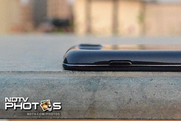
The MacBook Pro is just 0.7 inches thick. That's the same as the Air at its thickest point, but unlike the Air, the Pro doesn't taper into a wedge shape. It's the same thickness all the way through, making it feel a lot more substantial than the Air.
The screen is partly to blame for this. That's because the sharper screen is also darker. To get it looking as bright as other laptops, Apple has to pump more light through it. More light takes more power. To get the Pro to last for about seven hours of work (a claim I did not have time to test), Apple had to increase the size of the battery. It takes up nearly half of the internal space of the laptop.
I suspect the Retina screen is coming first to a relatively big MacBook because its chassis provided Apple with the space to expand the battery. In a MacBook Air, there's no space for a bigger battery, so a Retina screen would have meant shorter battery life. That would have been a tough sell.
I hope Apple or another manufacturer figures out a way around the battery issue, because I want to see this type of display in every device. Of course, desktop displays aren't limited by power consumption in the same way, so we can hope to see super-resolution monitors soon. It's time for our computers to give us glasses

Sony Cybershot DSC-WX300 review


Sony_WX300_Review_01_174613_134653_5342.jpg

Point-and-shoot cameras are at an interesting place. Many believe that point-and-shoot cameras will soon be replaced by smartphones that have very capable cameras, and the likes of iPhone 5, Nokia Lumia 920 and others are proof of this trend. However, one advantage that point-and-shoots continue to have over smartphones is optical zoom, and having a huge optical zoom can indeed be of great use.Sony likes to call the Cybershot DSC-WX300 the smallest point-and-shoot camera with a 20x optical zoom, and on it's own the camera indeed looks tiny. Let's take it for a test and see what it holds.
In the Box
  • Sony Cybershot DSC-WX300 camera
  • Manual
  • Warranty card
  • Power cable
  • USB charger
  • USB cable for charging
  • Hand strap
  • Battery
  • HDMI cable
  • 4GB memory card
Build/ Design
The Sony Cybershot DSC-WX300 is a small little camera when you hold it in your hand, but the moment you put it next to another point-and-shoot you realise it is not as small as it initially seems. Having said that, you have to admire the work of the Sony design and engineering team for managing to put a large 20x optical zoom into such a small body.
The camera fits nicely in the hand and the rounded edges make it easy to hold. The controls are easy to reach and comfortable for one-handed use. The back of the camera is taken over by a huge 3-inch LCD that is nice and bright both indoors and outdoors. The LCD is not a touchscreen but shows all the information you need. It is also a bit of a fingerprint magnet, as one cannot avoid touching the screen at times and needs to be cleaned frequently.
Sony_WX300_Review_02_174613_134653_4482.jpgThere is no rubber padding for the grip and at times I did feel that the camera was slipping out of my hands, but thanks to the hand strap around my wrist I knew I would not drop it.
The memory card and the battery other go under the camera, adjacent to the HDMI port. There is a multi-function Micro-USB port on the right hand side for charging as well as transferring data.
The WX300 has a built-in flash at the front of the camera, stereo microphones on the top of the camera and uses a USB based charger that relieves you of carrying a spare charger too. It's good to see that Sony includes an HDMI cable with the camera.
If you are interested in using the camera with a tripod, it's worth pointing out that with the lens fully out, the camera falls over when kept on a flat surface. Thus, if you are looking to shoot at full zoom, you are advised to carry a full-sized tripod and something like a GorillaPod won't do.
The camera is available in four colours and we tested the Black one.
Sony_WX300_Review_07_174613_134653_1362.jpgFeatures / Performance
Sony Cybershot DSC-WX300 does not feature any manual controls like most other point-and-shoot cameras. It comes with eight preset modes that you can choose from, selectable via a rotating dial. The dial lets you choose between a Scene mode, a Background defocus mode (ideal for clicking portraits), an Intelligent Auto mode (indicated on the dial in green), a Superior Auto Plus mode, Program Auto mode, rama mode, Movie shooting mode and a 3D mode.
The Scene selection mode features further sub-modes based on the type of picture you are trying to click including Soft Skin, Gourmet (for food shots), Night Scene, Landscape, Snow, Fireworks and more. The Intelligent Auto mode is the one you would use on this camera to take most of your pictures. If you use the Intelligent Auto+ mode, the camera takes multiple shots and overlays them giving you a picture that's a bit more saturated but appears nicer to the naked eye, especially if you are shooting in a dimly lit room. However, for me this was a complete no-no, as most pictures ended up loosing details.
The Panorama mode on the WX300 is very well implemented and it takes a panorama beautifully, unlike it's predecessors where the camera kept constantly reminding you to go slow or go fast. With the WX300 one just sweeps through and gets the work done, and was so much fun that I ended up shooting quite a few panoramas.
Sony_WX300_Review_04.jpgNext to the mode dial on the top of the camera is an aptly sized shutter button with a toggle zoom control. The button is placed well and right next to it is the power button that is recessed so you don't hit it accidentally when clicking a picture, or when someone else is taking a group shot for you.
The camera has no manual controls, be it for focus or for shutter/ ISO so if you are an advanced user you may find this restricting. I did not miss these controls during the time I spent with the camera.
The WX300 comes with built-in Wi-Fi, which means you can set it up a secure Wi-Fi hotspot so your smartphone and tablet can connect to it. You can then use the display on your phone or tablet as a viewfinder and trigger a shot. This is especially useful in case you are taking a self-portrait or a shot at a difficult level. Unfortunately, the app is available only for Android phones and tablets, and not iOS. You can also transfer pictures from the camera to your computer, mobile or tablet over Wi-Fi.
Focus System
The auto focus on the Sony Cybershot DSC-WX300 works quite well, though it has its limitations. For example, if you are shooting an object or a person at full zoom, it seems to be a bit slow and takes its time, but in almost all other conditions its quite responsive. The tracking focus function works both in still mode as well movie mode.
One drawback in the camera is a lack of macro mode, so if you like shooting flowers or other objects up close, you will be disappointed.
Sony_WX300_Review_05_174613_134653_2772.jpgImage Quality
The WX300 uses Sony's Exmor R back-illuminated 18.2-megapixel CMOS sensor. This gives it great agility when it comes to taking pictures both indoors and outdoors. Add the fact that the camera is small enough to carry in your pockets all the time, and it manages to become your great field companion.
The camera performed pretty well when it came to taking self-portraits and pictures of other people at night and focussed pretty well. The flash on the camera does not need to be popped, just enable or disable it from the menu before taking the shot. The flash on the WX300 is quite strong and some of the scenes end up with too much light and loosing their appeal. But in most cases the flash does a good job overall. However, thanks to the good sensor inside the WX300, you may not need the flash on many occasions.
The low-light images appear sharp and crisp. As I mentioned earlier, there are no manual controls on the camera, so I was slightly worried that the night scene pictures may come out grainy, but I was pleasantly surprised to find them sharp enough.
Sony_WX300_Review_03_174613_134653_3842.jpg
The powerful 20x optical zoom on the Sony Cybershot WX300 in action. The image above is clicked at full zoom with the inset of the traffic cop taken at 20x optical zoom from the same spot.The full-zoom pictures also came out nice (see sample shots above and in the gallery). The body's built-in image stabilisation is pretty accurate for a camera this small.
The WX300 also has a 10 frames-per-second mode, and it manages to capture an action scene pretty well. Though Sony claims that the resultant images are full-resolution, I felt that some details were lost in the high-speed mode.
To put the camera through a tough test, I took a night-shot of a backlit taxi sign. Though the picture came out very sharp and crisp, I noticed a shift in colours. While, this can always be corrected during post-processing by changing the temperature of the image, I was slightly surprised that this happened in a camera that produced otherwise accurate colours.
Sony_WX300_Review_06_174613_134653_2072.jpgVideo
The video mode is pretty well-executed and the camera is capable of taking full-HD videos. The WX300 has a very sensitive set of microphones, which is generally a good thing as it picks up even minute sounds, but if you are in a very noisy environment, it can work against you.
The videos taken with the camera are sharp and full of details, and, as you would expect, it is also possible to capture stills while recording video. The tracking focus and zoom capabilities work well to give you a blur-free video.


Battery Life
The Sony Cybershot DSC-WX300 has a small battery and the entire package (battery + camera) weighs just 166 grams. Looking at the size, I was worried if the camera would be able to last an entire day, but that fear was unfounded as I could shoot an impressive 300 shots, including a few panoramas and a video, on a single charge. As mentioned, you can charge the camera over USB, which means should it run out of juice, your mobile charge can perhaps double up as a charger for the WX300.
Verdict
Overall, the Sony Cybershot DSC-WX300 is quite impressive with good image quality and a 20x optical zoom that lets you click some interesting pictures. The lack of manual controls bothered me personally, but the target audience of the camera won't mind it as much. The lack of iPhone app to go with the Wi-Fi features of the camera might limit the camera's appeal as well


Price: Rs. 19,990
Pros
  • Powerful and sharp zoom
  • Good quality images and video
  • Built-in Wi-Fi

Cons
  • Slightly slow autofocus at full zoom
  • Missing macro detection in auto mode
  • No rubber grip for thumb rest
  • No iPhone app
Ratings (Out of 5)
  • Build/ Ergonomics: 3.5
  • Features / Performance: 4
  • Image Quality: 4
  • Video: 4
  • Battery Life: 4
  • Value for Money: 4
  • Overall: 


Sony launches SmartWatch 2, a 'second screen' for Android smartphones


sony_smartwatch2_good.jpg


sony_smartwatch2_good.jpg

Sony has officially launched SmartWatch 2, the successor to its SmartWatch.
Sony SmartWatch 2 comes with a bigger 1.6-inch screen with higher resolution 220x176 pixels resolution, compared to the 1.3-inch screen 128x128 display on its predecessor. Sony is positioning the watch as a second-screen for your Android smartphones, letting you receive notifications from the phone as well as control its functionality.
SmartWatch 2 makes it possible to access notifications from your wrist such as messages, calls, email, Facebook or Twitter, Calendar, or use it as a remote for your Walkman or other digital media player. The SmartWatch 2 comes with a bunch of pre-installed apps, with an option to load other apps as well.
Other things you can do with the SmartWatch 2 include:
  • Take a photo remotely from your SmartWatch, using a smart camera app.
  • Control your presentations remotely using Presentation Pal.
  • Taking a run or on the bike? Select a mapping app on SmartWatch to check your route with a quick glance at your wrist.
  • Read previously downloaded e-mails when not connected to your phone.
  • Use lifestyle apps like Runtastic to map and instantly track your fitness activities on the go.
  • Quickly adjust the tracks and volume on your music player.
Sony SmartWatch 2 comes with NFC connectivity and can be charged via a standard Micro-USB cable. It is water-resistant (IP57) and users can customise it by using any standard 24mm strap.


Sony SmartWatch 2 technical specifications
  • Works as an NFC watch with all smartphones using Android 4.0 (Ice Cream Sandwich) and later
  • Battery time - Low usage 7 days, Normal usage, 3-4 days (Watch always on)
  • Bluetooth 3.0
  • Android release: 4.0 and later
  • Charging with micro USB
  • Transflective LCD 1.6", pixels: 220x176
  • Languages: English master, Chinese (Trad), Danish, Dutch, English, French, German, Greek, Japanese, Portuguese, Czech, Russian, Polish, Spanish & Swedish.
  • Apps/plugins ready-to-go: App recommender, Facebook, Twitter, SMS, MMS, Missed call notification, Calendar notification, Email, Google+, New events - aggregator, Missed call, RSS, Gmail, Viewfinder (remote camera shutter), Phonebook, Music player, Find phone, Call log, Weather, Time, date.


Samsung Galaxy NX mirrorless camera press shots leak


Samsung_Galaxy_NX.jpg

There have been news reports suggesting that Samsung will be revealing its Galaxy Camera 2 at its "Samsung Premiere" press event being held on June 20th. Recently some leaked images of this camera too were leaked online. Just days before the camera is due for an official release, its press shots too have been spotted online. The photos have been posted on Vietnamese website camera.tinhte.vn, which claims that this camera will be dubbed Galaxy NX. If these leaked pictures are indeed true, then the Samsung Galaxy NX has very little resemblance to the existing Samsung Galaxy Camera.
Furthermore, Galaxy NX is also bigger in size than any other mirrorless cameras that Samsung is currently offering. From the leaked images, it also appears that the Samsung Galaxy NX camera will have no physical buttons. It is also likely to come with a 4.3-inch touchscreen with qHD display.
Samsung Galaxy NX camera is expected to come with 20.3-megapixel APS-C sensor and will support full-HD video recording. The camera is expected to be running on Android 4.2.
Internally, Samsung Galaxy NX will pack in Samsung's Exynos 4 quad-core processor along with 2GB of RAM. The camera will either offer 8GB or 16 GB of internal storage.
From the leaked press shot, it also appears that Samsung will be offering at least three compatible NX lens options for its Samsung Galaxy NX camera.
So far there is no word on when this camera will start retailing and what could be its tentative price.
Samsung is expected to unveil new Galaxy and Ativ devices on June 20 in London. 

Samsung rolls out first curved, super-thin OLED television for $13,000

Samsung Electronics Co Ltd slapped a $13,000 price tag on its first curved, super-thin OLED television to go on sale, the same price as rival LG Electronics Inc and one that underscores the high costs of the technology.
Samsung is hoping that its success with OLED screens in smartphones such as its Galaxy S4 will also pay off in TVs, but consumers interested its 55-inch screen television must be willing to pay some five times more than popular flat-screen equivalents.
At the moment, OLED televisions are still very much a niche market and Samsung warned that industry forecasts for sales growth were a bit too optimistic.
"We have just introduced our first OLED TV and have to see consumer response to gauge overall market demand," Kim Hyunsuk, a Samsung executive vice president, told reporters.
Research firm DisplaySearch has forecast global industry-wide sales of OLED televisions at 50,000 this year, at 600,000 next year and rapid growth thereafter to reach 7 million in 2016.
LG, which currently offers both curved and non-curved 55-inch screens, is estimated to have only sold a few hundred screens so far after starting sales earlier this year.
Samsung said it will begin selling its curved OLED television outside South Korea from July but did not specify which countries. It has no plans to offer a non-curved one this year.
Organic light-emitting diode technology has long been touted as the future of consumer electronics displays, offering crisper picture resolution, a faster response time and high contrast images. It also allows for curved televisions, which manufacturers say offer a more immersive TV experience.
Both Samsung and rival LG Display, a unit of LG Electronics, have invested heavily in OLED, seeking to emulate the success they had with LCDs, which helped them squash Japanese rivals such as Sony Corp and allowed them to capture coveted roles as suppliers for Apple Inc.
Samsung is now the world's biggest TV manufacturer, and the South Korean duo now sell almost half of all TVs worldwide.
Not one to put all its eggs in one basket, Samsung also unveiled on Thursday 55-inch and 65-inch ultra-high definition (UHD) TV sets, which offer crisper LCD picture resolution.
Ultra HD TV sales are likely to grow 930,100 this year from 9,600 last year and may jump to 3.9 million sets next year, according to DisplaySearch.
© Thomson Reuters 2013

LG to start mass-production of flexible displays this year

Flexible OLED displays may come to a screen near you sooner than imagined.
According to a report by The Korea Times, LG Display will be manufacturing flexible display panels for major smartphone producers starting fourth quarter of this year.
LG's Frank Lee told the publication that LG had completed the development of its first flexible displays and would be mass-manufacturing them from the fourth quarter.
The displays will be based on organic light-emitting diode (OLED) panels and would offer an ultra-high definition (UHD) resolution also known as 4K. Apparently, the company's E2 line at its display complex in Paju will be used for the production of these displays.
Flexible displays are thinner, lighter and more durable when compared to the presently popular glass displays. These also happen to be much more impact resistant.
According to the report, LG Electronics plans to release the first flexible display smartphone later this year.
Samsung had showcased its flexible display technology at CES 2013 with its OLED Youm Display. The company had also shown a functional prototype of a flexible display smartphone. So clearly, flexible displays happen to be underway from Samsung as well. But the question is whether LG will beat Samsung to it. Based on the reports so far, LG does seem a plausible candidate to bring the first flexible display to the mass consumer market.
LG and Samsung are already offering curved OLED televisions. The technology offers better viewing angles and a better overall experience. Company officials told The Korea Times that LG would expand this OLED portfolio to 65-inch and 77-inch panels as well.

Review: Sennheiser HD598


sennbeige.jpg

Famous for it's quality headphones, Sennheiser offers a range of products that suit a variety of pockets. Prices range from affordable to insane - like the HD 800 (read review here). But this review is about the HD 598 which claims to offer high caliber sound at a lower price. Just how high caliber is what we intend to find out here.


Build and Design

The HD 598 is of Sennheiser's usual high quality. Unlike most headphones in the market, the HD 598 is offered in beige, which makes it stand out in comparison to its peers. Cool quotient apart, critics will carp about the colour's tendency to show dirt.

On the whole, the construction of the HD 598 reminds us of a D-segment vehicle - those beige plastics, leather upholstery and faux wood bits! It's like Sennheiser got Toyota on board to help choose the colour palette.

The headband of the headphone offers cushioning, which is covered with a faux leather layer.

All these elements give the HD 598 a love it or hate it quality. While we loved it many people in our office were not that impressed.

Generally, looks are pretty subjective and the same holds true for the Sennheiser HD 598. Looks apart, the general build of the headphones feels pretty solid.

As impressive as the build quality is the fact that the headphones are extremely light and weigh only 9.5 ounces. We could hardly feel them on.

The ear cups were large and cozy. They were made up of micro-fiber like material with a decidedly velvet-like feel.

Besides this, Sennheiser also provides a 10-foot long cable which is user replaceable. The 6.3mm jack is gold plated but Sennheiser provides a neat 6.3mm to 3.5mm adaptor, which fits perfectly unlike the cheap Chinese adaptors that are available in the grey market.

Sound Quality
The Sennheiser HD 800, which we tested for a week or so, is certainly the gold standard of headphones but unaffordable to most at a hefty price tag of Rs 78,000. In comparison, the HD 598 aims to provide quality sound to the masses at Rs 12,500. It may not sound as epic as the HD 800 but, for the most part, it is good value for money producing lush, warm and balanced sound.

How to does it achieve this? Quite simply, by borrowing a lot of technology from the exalted HD 800.

Like it's big brother, the HD 598 gives a sense of immense space and the feeling that the sound is coming from the front, rather than the back. This happens thanks to Sennheiser's Ergonomic Acoustic refinement technology, which made its debut on the HD 800.

To add to rich mid-range we also get neodymium magnets, Duofol drivers and ultra lightweight aluminum coils.

Sound quality-wise, the HD 598 holds its own against the competition. In comparison to the Dr. Dre Monster Beats, the HD 598 provides a more soothing aural experience. While the Beats offers a gargantuan low-end thump, the Sennheiser HD 598 provides a more balanced sonic quality as it focuses on the whole sonic spectrum equally. It is also very impressive in comparison to the Skull Candy Aviators as it provides a richer sound.

Another impressive feature is the 50 ohms impedance, which is more than adequate to power the speakers via an iPod, though for a true sound test its always advisable to check the headphones through high quality amplification.

For our tests we plugged the headphones into our M-Audio Pro-fire 610, which provided an incredible boost to the sound output.

Our usual starting block is Sweet Child O' Mine which is well known for its sweet harmonic mid range response. Slash's searing lead riff is the signature sound of the song but often most headphones struggle to replicate the intended harmonic overtones. The HD 598 reproduces this particular facet of the sound with a great deal of panache. The vocals were crisp and the bass was pretty substantial. On the whole, it was a pretty satisfying experience.

Next up on our test list was power ballad Breathe Again by Alter Bridge. This song sounded absolutely beautiful on the HD 598. From the baritone vocals of Myles Kennedy to the shimmering chords of Mark Tremotti, everything sounded balanced. We must admit the sound was a tad shriller than on the Bowers and Wilkins P5, but on the whole it was very impressive. We must also note that the Bowers and Wilkins P5 headphones are a good 6K more expensive.

Now we decided to test some progressive metal in the form of Tool's Sober. Normally, the harsh sound of metal induces clipping and the HD 598 was no different as on maximum volume levels clipping was very evident. Having said this, we must also point out that the moment we rolled the volume down the song sounded fantastic. The chugging riffage of Adam Jones was heavy yet detailed, the oddly timed drum rolls of Danny Carey were crisp and Maynard Kennan's vocals were haunting. Overall, the song maintained immense clarity once the volume was rolled off.

From the word go, the Sennheiser HD 598 sounded very sweet and on the whole the headphones performed very well. While we missed the audiophile grade flat response, the colored sound for the most part delivered a thoroughly enjoyable listening experience.

Verdict
With its balanced sound and comfortable fit the HD 598 is one of the better headphone offerings currently available in the market.

While the sound is definitely colored, it is also more balanced than its competitors. These headphones are not aimed at audiophiles demanding sonic perfection but at those who just want high quality audio. They are worth every penny of the Rs 12,990 price tag.

Pros
Balanced Sound Quality
Comfortable design
Long cable

Cons

Clips at high volumes
Beige color may not suite everyone
Slightly expensive

Ratings:

Price: 3
Ergonomics: 4
Performance: 4
Wow Factor: 4

Temple Run for Windows Phone 8 updated to work on devices with 512MB RAM


temple-run-for-windows-phone8-635.jpg

Popular "endless running" game, Temple Run, which debuted on Windows Phone 8 earlier this year, has now been updated to support phones with 512MB RAM.

While there's no official change log on the game's listing page on the Windows Phone store, the game's developer, Imangi Studios, talked about the update through its Twitter handle.
Temple Run for Windows Phone was criticised for its hardware and software requirements, namely, 1GB RAM and Windows Phone 8, which meant that the game could be played only on a handful of phones - HTC 8X and Nokia Lumia 820, Lumia 920 and Lumia 925 - could play the game. Users running an older version of Windows Phone, or having lesser RAM on their phone were left high and dry.

While the game is still limited to Windows Phone 8, the developer of the game, Imangi Studios, has now optimised it to run on phones with 512MB RAM. Following the move, a large number of users would be able to play the game as Nokia's recently launched entry and mid level Windows Phone 8 handsets such as the Lumia 520, Lumia 620 and Lumia 720 come with 512MB of RAM. The HTC 8S mid-range Windows Phone 8 smartphone also comes with 512MB of RAM.

However, at the time of writing this post, we were not able to find the game on the Windows Phone Store while using the Nokia Lumia 520. We also tried opening a link to the Store via Internet Explorer and encountered the same "This app uses features your phone doesn't have" error that we used to get earlier. Perhaps this could be due to the update not being rolled out to the Indian store at the time of writing this post.

The launch of original Temple Run on Windows Phone 8 arrived after Imangi Studios released multiple successors to the game on various platforms. Biggest success on those has been Temple Run 2, that became the fastest growing mobile game of all times, when it clocked over 50 million downloads in just 13 days. We'd look forward to the developer porting other versions of the game to the Windows Phone platforms

Google Earth for iOS update brings Street View support, updated search and 3D directions


Google-earth.jpg

Google has updated its Google Earth iOS app bringing new features including Street View support and improved directions and search features, in addition to an enhanced user interface.

The Street View feature allows users to view and navigate street-level imagery in a manner similar to that of Google Maps. The feature was already present in the Google Earth desktop app and made its way to the Android app last month.

The updated app also offers transit, walk, bike and driving directions in 3D and updated search that allows users to browse results quickly. Updated directions let you visualise transit, walk, bike and drive directions in 3D while update search result list will let you browse search results quickly.

It's worth noting that not all features are available in all regions, and indeed the Google Earth app itself  is not available in the India App Store. Even if you download it through another country's App Store, the app doesn't offer Street View or directions for Indian locations.

The also offers a new slider menu at the left that allows users to browse and enable different layers.

Google has also announced that it's pushing cloud free satellite imagery in Google Earth and Google Maps. The new satellite imagery can be seen by turning on satellite view in Google Maps and by zooming out while accessing the Google Earth app.

The update also features refreshed imagery for some new regions of the world, especially where high-resolution imagery was not available, including parts of Russia, Indonesia, and central Africa. 

GOOGLE NOW VS IOS SIRI

Google Now is often compared with the Siri voice assistant on Apple's mobile devices, but its power lies in giving you information you need to know before you have to ask. It works best as a supplement to Siri, rather than a replacement, now that it has expanded from Android devices to iPhones and iPads.
Both Google Now and Siri will respond to voice commands, whether it's to look up the day's weather or set the alarm on the phone. Google Now goes further in filling your phone screen with boxes containing stock quotes, sports results, weather, travel directions and more - all without making a request.
Those choices are based partly on your location, the entries in your calendar and the travel-confirmation messages in your Gmail account. To use Google Now, you have to give Google permission to use your personal data. You can create a separate Google account if you're not comfortable with that, though Google Now works better the more it knows about you. It works best if you also let it record and analyze the Google searches you've made recently.
For the past several months, I've had a chance to use Google Now on Android in 13 states and in Thailand. I've found it particularly useful while traveling. As soon as my plane landed in Orlando, Fla., on a trip this year, Google Now offered "cards" with details on my hotel and my car rental, based on confirmation emails sent to my Gmail account. Clicking the hotel card got me turn-by-turn directions to the hotel using the Google Maps app. On the way home, Google Now gave me the gate number for my connecting flight in Charlotte, N.C., as the first plane taxied from the runway.
Now, iPhone and iPad owners can get that, too. Google Now became available on Apple devices this week. Simply download the free Google Search app through Apple's app store.
For the most part, the Apple and the Android versions are similar in terms of the information they present.
But Google Now isn't as seamless to use on the iPhone or the iPad, mainly because Google doesn't have as central a presence in Apple's iOS operating system. On an Android device, clicking a Google Now card will often take you to a built-in Google app such as Google Maps or Calendar for more details. On the iPad Mini I tested it on, I got Web pages - at least until I manually installed Google's mapping app.
Google Now also isn't as easy to get to on the Apple devices. Holding the home button a second or two gets you Siri. Just speak to her with your question or search request. To use Google Now as a voice assistant, you need to open the Google Search app, and then tap on the microphone icon. Sometimes, you need to tap on the search box in the app for the microphone to appear. That microphone is sometimes on top, sometimes at the bottom or sometimes on the on-screen keyboard. (There's no home button to quickly get Google Now on Android, but you can skip one or two steps by finding the microphone on the top right of the home screen.)
To be clear, Siri is the better of the two - as a voice assistant. She'll always respond with something, even if it's to seek clarification. Google Now will often remain silent, sometimes giving you no more than a list of websites. Google Now's assistant also lacks Siri's feistiness and sense of humor. Siri, for instance, has more than a dozen witty responses to queries about the meaning of life. I compared the two for a review in March, so I won't dwell on that here.
Where Google Now shines is in anticipating your questions. Open the Google Search app, and you'll see cards fill the screen with useful information.
In Orlando, Google Now continually offered directions to nearby breweries, possibly because I had searched Google for information on tours. I got information on a co-worker's flight from Las Vegas because he had shared his Google calendar with me. And because I had searched for Flowers Foods for a story just before my trip, Google Now offered me directions to the baking company's headquarters in Georgia when I was about a half-hour away. I was actually headed to Montgomery, Ala., but I appreciated the gesture.
Later, in Bangkok and southern Thailand, Google Now was by my side with information on currency-exchange rates, language translations, tourist attractions and photo opportunities. It also told me the current time at home in New York, so I didn't need to figure out time zones myself.
On weekday mornings in New York, Google Now sends me notifications on how long my commute should take, based on public transit schedules at that time. It tells me about my commute home in the afternoon. It knows not to bother me with that information while I'm abroad.
Without typing or saying anything, I can press the search box on my phone and automatically get a card with the current weather and forecast. I can also get the latest Mets and Nets scores that way.
Google Now's judgments on what information I need to know can be sketchy at times
  • Although I thought the offer for directions to Flowers Foods was clever, I got annoyed with Google Now in Bangkok when it continually gave me directions to places I had searched but wasn't interested in visiting.
  • Searching for a company on Google often resulted in stock quotes on that company for a day or two, even though I don't own any stocks.
  • When I'm near a Barnes & Noble, I often get a card saying I could research products there. Clicking on the card gets me a link to the retailer's website and a chance to "Scan for product information." There was a camera icon, so presumably I could photograph a bar code or other identifier. It's not clear why I'm limited to being at a Barnes & Noble to do that and why Google thinks I need it just because I'm near a store.
Despite getting stray information at times, I find Google Now useful enough to leave it on. I could always customize the service by telling it never to give me stock quotes, for instance. And some of the cards are enabled only when I have Google's Web History feature turned on through my Google account settings. (Newer accounts come with that feature already on, but you can turn it off and still use Google Now.)
You do have to give Google Now permission to scan contents of your Gmail account, but it's typically limited to confirmation notices from airlines and hotels rather than discussions of hobbies and medical conditions. You also must give it permission to access calendar entries. Privacy worries aside, Google Now's appeal is in what it does with that data. That's why I'm OK with Web History.
Whatever you think of the rivalry between Google and Apple, don't look at Google Now as a Siri-killer. Think of it as a companion for the tasks you can't accomplish with a simple voice search.

Google making Android-based gaming console and smart watch

Google is working on a videogame console and smart watch powered by Android software that has been a hit in smartphones and tablets, the Wall Street Journal reported Thursday.
The Journal cited unnamed sources as saying that the California-based Internet titan is out to expand its hardware line-up to include a new version of a Nexus Q digital media device introduced last year but never brought to market.
Google has openly shared a vision of its free Android operating software being used to put brains into a broad range of devices, including typically 'dumb' machines such as refrigerators or clothes dryers.
Efforts to develop a watch and a game console come as rumors spread of plans for a new-generation Apple TV box, as well as a smart watch, from Google's Cupertino, California-based rival.
Microsoft and Sony have also set out to tighten their grips on modern-day home entertainment with new generation Xbox One and PlayStation 4 videogame consoles, which are to be released late this year.

Google did not return AFP requests for comment.

FACEBOOK HOME APP REVIEW

When I got my first smartphone in 2010, I checked Facebook obsessively. But over time, the novelty wore off and opening Facebook's app to check photos, links and posts from friends turned into a chore.
In a sense, I'm the ideal target for Facebook's new Home app. Those photos, links and posts I couldn't be bothered to check on the social network's app automatically come to the screen when I turn on the phone. I can see friends' musings scroll by, as photos they've chosen to highlight take up the entire screen in the background. A new one appears every seven seconds.
It's as if Facebook has taken over the phone's prime real estate and pushed Foursquare, email, weather, YouTube and my alarm clock to the slums.
Home is ideal for people whose lives are centered on Facebook. Others might not feel at home.
At first, the free app is available only on certain phones running Google's Android operating system - HTC Corp.'s One, One X and One X Plus and Samsung Electronics Co.'s Galaxy S III and Galaxy Note 2. It will work on the Galaxy S 4 when the phone goes on sale in the coming weeks.
If you have a Facebook app already installed on one of those phones, you'll get a prompt when Home is ready to download on Friday. Otherwise, visit the phone's Google Play store to get it. Home comes already installed on the HTC First, which ships Friday and costs $100 in the U.S. with a two-year AT&T Inc. service contract. I had a chance to spend several hours with a First that Facebook Inc. lent me to try out ahead of Home's public debut.
Facebook has no current plans to bring Home to the iPhone, iPad, BlackBerry or Windows devices. That's because Google makes Android available on an open-source basis, free for anyone to modify, so it's easier to make changes.
That last part is key to the Home experience. Normally, Google's apps and services are front and center. Android makes it easy to get on Gmail, navigate with Google Maps and search for things using its Google Now voice assistant - all with a tap or two on the phone. Facebook is taking advantage of its rival's open-source policy to place its apps and services front and center.
Right from the home screen, you see the things your friends are sharing on Facebook. Not interested in what Dave has to say? There's Mary replacing him in seven seconds, and Jennifer replacing her seven seconds later. Mixed in are posts from some of the groups you follow. Facebook says you'll eventually get ads there, too.
Facebook calls this the Cover Feed. I call it Facebook on steroids.
I hardly have time to digest a post before a new one appears, and in many cases I'm seeing only the first several words in a post, hardly enough to convey a thought. The good news is that I can pause the stream and view the full post at any time by tapping the screen. In doing so, I can comment on a post or hit a "like" button. The scrolling stream continues with another tap.
As the text of your friend's post appears, you'll see in the background the person's cover photo, the large image your friend chooses to display at the top of his or her profile page. Because cover photos are horizontal, and the app is designed for vertical use, you're seeing only a snippet at a time. The part that is visible shifts over those seven seconds, as if a camera is slowly moving across, similar to the panning technique used in Ken Burns documentaries.
If the post is of a photo, you'll see that image rather than the cover photo in the background. Again, you're only seeing a snippet - a part of the elephant, but not its whole. To view the full photo, you have to tap and keep your finger on the screen - though that can block part of the image. I prefer the way Facebook's regular app handles photos: More of the image fits on the screen, even if it's smaller.
I had a few Facebook chats going as I was testing Home. The profile photo of the person I'm chatting with appears in a small circle to the side. I simply click on it to open the chat screen, where I could type a reply. Text messages I get appear this way, too. I found the Chat Heads feature fun, as I moved my friend's images to the left, to the right, to the corner - and eventually to the trash.
The fun ended when I tried to use the phone for other things. When I tried to dial a phone number, for instance, the friend's head obstructed the number 3, forcing me to move it before continuing to dial. Chat Heads became intrusive, even off to the side.
To get to those other things, you drag a circle with your profile photo to one of three buttons. One gets you Facebook's messenger app, which lets you chat just like Chat Heads. Another gets you the menu of apps on your phone, including the app for making calls. A third is supposed to take you to the most recently used app, though it's hit or miss whether it's actually the last app I used.
I wish I could add other buttons for frequently used apps, such as Foursquare and Instagram. Although I hardly use the phone to make calls, a quick button would help, particularly for emergency calls. To get to Android's traditional home screen on the HTC First, I had to drag my profile photo to the App Launcher, swipe the screen to the right and click "More..." A button to get you straight there would have been nice, too.
Facebook has promised to update Home with new features and bug fixes at least once a month. So it's possible my gripes will be addressed over time. In fact, Facebook is limiting Home to a small number of devices so it can make sure it's done right. I look forward to seeing where Facebook goes with it.
The one feature I like from the start is Notifications. With Android, alerts such as new messages and missed calls typically appear as tiny icons at the top of the screen. You have to drag down the top to get details. With Home, those details pop up in the middle of the screen and demand your attention. It's similar to how the iPhone and the iPad handle alerts.
Facebook was late in setting me up with a phone and app to try it out, so I didn't have as much time as I would have liked with Home. It's quite possible I'll warm up to Home after spending more time with it.
I might not get that chance, though. I'm fearful of what it'll do to all the non-Facebook apps I now use and enjoy, so I'm not sure I'll be rushing out to download Home on my personal Android phone on Friday. As much as I like not having to do a lot of work to use Facebook, all that ease makes doing other things on the phone a chore.

Nvidia unveils GeForce GTX 760 GPU


geforce_gtx_760.jpg

Nvidia has announced the launch of GeForce GTX 760 GPU with the Nvidia Kepler architecture, joining company's lineup of gaming GPUs including the recently unveiled GTX 780 and GTX 770.
The GeForce GTX 760 GPU supports Nvidia's gaming technologies, including the PhysX physics engine, Nvidia TXAA anti-aliasing and GeForce Experience software. The GPU also includes Nvidia SLI technology, the multi-GPU solution that scales to deliver even higher levels of performance, with new adaptive temperature controllers designed to operate silently.
"For gamers seeking insanely fast performance and smooth frame rates for their favourite games, the choice is clear: NVIDIA GeForce GTX GPUs," said Scott Herkelman, general manager of the GeForce GPU business at Nvidia. "At a starting price of only INR 19,499, the GeForce GTX 760 ushers in a new level of performance, features and affordability, so gamers can experience today's most graphically demanding titles with all the eye candy turned high. It's a great time to be a PC gamer!"
In addition to the new features, the GeForce GTX 760 represents a performance upgrade over prior GeForce GPUs. It is three-times faster than the GeForce GTX 275 GPU and twice as fast as the GeForce GTX 560 GPU, according to Nvidia's own benchmarks.
Nvidia GeForce GTX 760 GPU is available now from leading add-in card suppliers, including Asus, Galaxy, Zotac. Pricing is expected to start at Rs. 19,499 for reference clock designs

Microsoft Xbox One: Will gamers want it?

After four years of development, Microsoft unveiled the Xbox One entertainment console and touted it as an all-in-one solution for playing games, watching TV and doing everything in between. Microsoft wants the Xbox One to be central to your living room and packed the new Xbox with such features as the ability to change TV channels through voice commands.
Although the device won't go on sale until later this year, at a price that hasn't been disclosed yet, Microsoft invited attendees of Tuesday's announcement event to take a closer look at the system.

Based on limited time with the device, the Xbox One feels like an improvement over its predecessor. But it fails to include features some fans have demanded, including the ability to play games bought for the existing Xbox 360 system.

Of course, many particulars about the Xbox One could change between now and when it's released. The specific date hasn't been revealed. More details are expected at the E3 video game conference in Los Angeles next month.

For now, the system looks to be a thoughtful piece of technology, but there's still a lot that isn't known.

Design: With contrasting matte and gloss finishes, the Xbox One is the slickest video game console so far, although we don't yet know what Sony's upcoming PlayStation 4 will look like. (Nintendo's Wii U came out in November and is the only one of the three new consoles already available for purchase, though sales have fallen short of the company's forecasts.) The Xbox's outer shell, which Microsoft calls "liquid black," features vented flourishes and all the inputs and outputs one might need, including multiple USB ports and HDMI pass-through.
Kinect: The new version of the Xbox's camera-based Kinect system comes with better motion and voice detection, including the ability to recognize faces, tell if you're smiling or talking and gauge your heart rate. It appears as sexy as the Xbox console, but has been overhauled under the hood. It's three times more sensitive and has a larger, 60-degree field of view. In a demo, the doodad's high-definition camera easily displayed crystal-clear 1080p video and could detect up to seven people, though it lagged as more folks stood in front of it. The basic motion detection appears vastly improved, but the voice detection feature wasn't made available to try out, adding to the list of unknowns.

Performance: The system seems to work harmoniously together. For example, by combining the Kinect's face detection ability with the machine's wireless controllers, it recognized - almost magically - when users swapped controllers.

Controller: The new controller's layout is mostly unchanged, but the bulky battery bump is gone from the back. The smoother Xbox One controller boasts a new directional pad and vibrating trigger buttons. The triggers pulsated in tandem with such imagery as a character's heart beating and a car revving up during a demo with a prototype controller.

Requirements: Luckily, the Xbox One won't require a constant connection to the Internet, but there's a possibility that some of the key features wouldn't work as well or at all. The Kinect system is required and will come with the machine, rather than sold separately as has been the case with the Xbox 360. The Xbox One also will feature privacy settings so it doesn't feel like the Kinect's camera is always watching you.

Limitations: Xbox 360 games won't work on the Xbox One because the underlying technology is different, according to Microsoft. Microsoft was vague about how the Xbox One will handle previously played games bought from other gamers, though it confirmed used games will work somehow. There had been talk that Microsoft might restrict used games on the new machine.

Games: What games? Despite the fact that such titles as "Call of Duty: Ghosts," "FIFA 14" and "Forza Motorsport 5" were teased during Tuesday's flashy presentation, actual games weren't available to try out afterward. Microsoft said it plans to focus on Xbox One titles in three weeks at the Electronic Entertainment Expo, the gaming industry's annual convention in Los Angeles.

The Xbox One shows promise with a sleek shell and a new Kinect detector that seems to perform fine - at least if you don't try to confuse it with too many people at once. But with a lack of games and lingering questions about what it can do without an Internet connection, there are too many questions about the Xbox One, even after experiencing - not just hearing - what Microsoft has planned. At this point, it's too early to say whether Microsoft or Sony is leading in the latest round of the console wars. They'll have to duke it out at E3.


NOKIA LUMIA 720 REVIEW


lumia720-1.jpg

The Lumia 720 is bang in the middle of Nokia's line of Windows Phone 8 offerings. It aims to offer some of the premium features found in the Lumia 920 (Review | Pictures) and Lumia 820 (Review | Pictures) at a price that's pocket-friendly like that of Lumia 520 (Review | Pictures) and Lumia 620 (Review | Pictures).
Does the Nokia Lumia 720 deliver on its promise or does it end up being a confused offering? Let's find out.
Build/ Design
It's easy to fall in love with the Lumia 720. Industrial design has always been Nokia's strength, and with the 720, the company seems to have outdone itself. The 720 takes Lumia 920's solid build and packs it in a smaller package that fits perfectly in the hand.
lumia720-2.jpg The Lumia 920 was ridiculed for being too heavy - and rightly so - and even though the 720 is no 920 replacement, we can't help but feel that, at least as far as design is concerned, this is the phone that Nokia's previous flagship should've been. We much prefer the matte finish on our Red Lumia 720 to the glossy Yellow 920 we got. Fingerprints are no issue with the 720, with the body as well as the screen remaining practically smudge free. The button placement on the Lumia 720 is similar to other recent members of the family. The right edge has the volume rocker, the power/ lock button and the dedicated camera button towards the bottom. The top edge has the microSIM and headphone jack, while the left and bottom edges feature the microSD slot and Micro-USB ports, respectively.
The front features much thinner bezels on the side, again, compared to the 920, which had a display that looked bigger than it really was, due to the wasted space on all four sides. While the Lumia 720 display isn't exactly edge-to-edge, it makes much better utilisation of the space.
lumia720-6.jpg Below the screen are the three standard Windows Phone buttons: Back (which doubles up as an app switcher on long press), Windows/ Home (long press for Speech) and the Search button, that continues to be as useless as ever even for Bing users like us, as it just brings up a Bing search box. We really wish Microsoft offered a unified search instead, or let us configure this button to launch something else entirely. Just above the display we have the Nokia branding and ear piece grill, with the front-facing camera just to the left.The back of our Red Lumia 720 has the rear-camera lens in the centre right next to the LED flash and Carl Zeiss branding. A NOKIA logo sits back in the middle, with the bottom part having three wireless charging pins and barely legible certification info as well as the text Made in China embossed. A speaker grill sits on the bottom left corner.
All in all, we'd go so far as to say that the Lumia 720 is our favourite Nokia phone till date, at least as far as industrial design is concerned.
Display
Nokia Lumia 720 comes with a 4.3-inch display of 480x800 pixels resolution, translating to a density of 217 pixels per inch. While that doesn't sound impressive, the real life experience is quite good.
Colour reproduction on the ClearBlack LCD is quite accurate. The viewing angles and outdoors visibility are as good as you'll come across. Like the Lumia 920, you can operate 720's touchscreen while wearing gloves.
Overall, while we sure wish the 720 sported a higher resolution display, there's no doubting the quality of this one.
Camera
The Lumia 720 comes with a 6.7-megapixel rear camera with Carl Zeiss optics that is a solid performer overall. The camera takes good photos outdoors when there's plenty of light. The colours look natural and don't appear saturated or artificial in any way. However, pictures clicked under bright artificial lights appear a little washed out.
In low light conditions, the Lumia 720 shines bright (pardon the pun). The LED flash works surprisingly well, and illuminates the subjects within its range uniformly. Even when you choose to disable the flash, the 720 delivers good results - not quite the 920 low-light image quality, but then this is a phone that costs half as much, which makes it especially great.
The camera software lets you tweak a few settings for still pictures like Scenes (Auto, Close-Up, Night, Portrait, Night Portrait, Sports, Backlight), ISO, Exposure Value, White Balance, Aspect Ratio, and Focus Assist Light.
The bundled Smart Lenses like Smart Shoot, Cinemagraph, Nokia Glam Me, Panorama and Bing Vision. We had mixed results with these. Cinemagraph (create GIFs from images) and Nokia Glam Me (add effects to images) are gimmicky at best, they work as advertised. However, when you come to Smart Shoot and Panorama, things get a bit rough.
Smart Shoot is Nokia's much advertised feature that detects faces - and other objects - and lets you do things like removing unwanted things from a photo and/ or mix and match 'faces' from a series of photos taken in the same setting. While this makes for a great demo, real life results leave a lot to be desired, as the phone failed to detect many faces in a group photograph.
lumia720-7.jpg Similarly, Panorama is a horrible implementation of what has become a standard feature in most phones. Instead of holding up your phone and just moving it around to take a Panorama, NOKIA chose to go a peculiar way. Click a photograph and watch it appear on the left most corner of your screen and stay there. You are then expected to align this picture with the real world view that you see on your screen, and when the two are perfectly aligned, click another one. And so on, so that the phone can 'stitch' these photos together. This definitely feels like an implementation from a bygone era that people are unlikely to put up with to click Panoramas from their Nokia Lumia 720.
Of course, the 720 is not the only phone that suffers from these drawbacks, as the other Windows Phone 8 members of the Lumia family use the same lenses.
In case you are wondering, Bing Vision can be used to scan QR codes and Microsoft tags.
The Lumia 720 is capable of recording only 720p video, which may disappoint the spec crazy, but is unlikely to be missed by most. There's no fancy stuff like image stabilisation - as found in the Lumia 920 - still, the smartphone is capable of taking decent videos. The built-in mic does a capable job of picking up the sounds, and the audio quality is good as well.
The 1.3-megapixel front camera can record 720p videos. Like most front cameras, it does a good job for video chats, and still photography in well-lit conditions, but leaves a lot to be desired in dim lights.
Software/ User Interface
Nokia Lumia 720 runs on Windows Phone 8, which means there isn't much room for customisation, other than preloading certain apps. Similar to its other Windows Phone 8-running Lumia cousins, the 720 comes with a host of pre-installed apps like BIGFLIX (entertainment), BookMyShow (booking tickets), Cosmopolitan (lifestyle magazine), HERE Drive, HERE Maps, Hike (messaging), Nokia Music, TripAdvisor (travel), and Zomato (food/ restaurants guide).
lumia720-3.jpg Standard apps like Internet Explorer, Office, One Note, Wallet, and the experience is no different than any other Windows Phone 8 device. As mentioned in the Camera section, the phone comes with some lenses, which also show up as stand-alone apps. These are Bing Vision, Cinemgraph, Nokia Glam Me, Panorama and Smart Shoot.PhotoBeamer is another interesting app that lets you beam your photos to any computer over Wi-Fi, providing an instant, wireless slideshow you can see over a large screen. During our tests, this worked as advertised.
Xbox games is your gaming hub, where most games get installed by default. You can maintain your profile and do other related activities.
We are big fans of the Transfer My Data app, which imported contacts and messages from our old Nokia phone over Bluetooth with minimum fuss. Another one of our personal favourites, the Drive app performs great as ever, and it remains our preferred navigation app on any platform, even above Google Maps. Nokia Music - with free, downloadable, DRM-free music for a year, is always well received as well.
Performance/ Battery Life
The Nokia Lumia 720 handles pretty much everything you throw at it without any hiccups. Yes, there's no quad-core processor, but you are unlikely to miss that in every day activities. From browsing, to playing music, to emails or editing Office files, everything goes off smoothly.
One area where we were keen to put Lumia 720 under the test was gaming. We installed quite a few games on our 720, including popular titles such Angry Birds, AE Bowling 3D, Ice Age Village, AE 3D Motor, 3D Brutal Chase, and AE Fruit Slash. We were able to play all these games without any hiccups.
One disappointing aspect of the Lumia 720 is the 512MB RAM, which means we couldn't even install games like Temple Run that need 1GB RAM. While we are disappointed with Nokia's decision to ship with half the RAM of what many cheaper Android phones are shipping with, we hope developers of games such as Temple Run can optimise their apps not to be so resource hungry. Perhaps that is an issue for Microsoft to address as well, as devices with much lesser RAM are able to run these games fine on other platforms.
lumia720-4.jpg Call quality on the Lumia 720 is rock solid, like most other Nokia phones. We are no fans of having loudspeaker on the back of the phone, since the sound gets muffled when the phone is lying face up, and, sadly, the 720 suffers on that front. The loudspeaker output is otherwise quite good. The phone takes a Micro-SIM and comes with expandable storage via a microSD card.
The Nokia Lumia 720 is unlikely to need a bail out in the middle of the day as far as battery life is concerned. On a full charge, we were able to get more than 26 hours before reaching for the charger, with the phone on 3G all the time and the screen set to full brightness. We also had three email accounts, two Twitter accounts and one Facebook account configured with notifications enabled, along with some amount of browsing, checking & sending emails, Twitter & Facebook usage, clicking pictures, and listening to our favourite songs on Nokia Music - or as we call it, just another day.
Verdict
At Rs. 18,999, the Nokia Lumia 720 is a really attractive proposition. The phone checks all the right boxes, from great looks, to a camera that performs quite well, and hardware that handles pretty much everything you throw its way. Yes, Windows Phone still has a long way to go before it can begin to compete with Android and iOS, but unless you are someone who must have access to the latest apps, it will do the job for you, since most popular titles, barring a few high-profile exceptions (like Instagram) are already here.
lumia720-5.jpg In terms of pricing, the Lumia 720 is sandwiched between the Micromax A116 Canvas HD (Review | Pictures) and Samsung Galaxy Grand Duos (Review | Pictures), but we recommend the Nokia, since it delivers a great design and a better camera, while maintaing a real-world performance that is at least comparable to its Android-based rivals.

Nokia Lumia 720 in pictures
Price: Rs. 18,999
Pros
  • Great design
  • Good camera performance
Cons
  • Some games don't run thanks to 512MB RAM
  • Windows Phone ecosystem still needs to catch up to Android and iOS
Ratings (out of 5)
  • Design: 4
  • Display: 3.5
  • Performance: 3.5
  • Software: 3.5
  • Battery Life: 4
  • Value for Money: 4
  • Camera: 4
  • Overall: 4

KARBON S5 REVIEW


karbonns5-1.jpg

The Karbonn S5 Titanium is the successor to the S1 Titanium featuring an upgraded 5-inch qHD display and an 8-megapixel rear camera. The phone was launched for Rs. 11,990, around Rs.1,000 more than the S1 Titanium's launch price. The S1 Titanium is now available online for Rs. 9,990. Is it worth spending Rs. 2,000 more to buy the S5 Titanium? We try to find out how the phone fares in all departments in our review.

Build/ Design
The Karbonn S5 Titanium looks a little different from its predecessor and is thinner. It also looks more refined compared to the S1 Titanium. However, it features the same rectangular slab form factor with rounded corners. The phone comes in White and Deep Blue colour variants and we got a Deep Blue phone as our review unit.
The front of the phone features the 5-inch qHD display, three capacitive touch buttons for navigation, and the front camera lens, in addition to the proximity sensor and the earpiece. The bezel is not that wide on the sides and doesn't take up a major part of the front unlike the S1 Titanium.
karbonns5-3.jpgThe Power/Screen lock is located at the right side of the phone, while the volume rocker key is located on the left side. The 3.5mm headset jack and the Micro-USB port sit at the top.
While Karbonn has mostly taken care of our gripes with the S1 Titanium's design in the S5 Titanium, the back of the phone is still made of plastic and is extremely glossy. You could use it as a mirror but it's a fingerprint magnet and it'll be full of smudges as soon as you start using the phone. The 8-megapixel rear camera lens is located towards the top along with a flash. There's some Karbonn branding towards the bottom.
karbonns5-10.jpgThe back cover is removable and hides the battery compartment. The two SIM card slots and a microSD slot are located just above the battery compartment.
Display
The S5 Titanium comes with a 5-inch qHD IPS screen that has a resolution of 540x960 pixels and pixel density of 221ppi, which is decent, and graphics and text appear sharp, although a 720p screen could have taken it to the next level. The viewing angles looked good. However, it's really difficult to read or take pictures in sunlight, as the screen is extremely reflective. Videos and pictures looked good but colours appeared to be a little saturated just like the S1 Titanium's screen.
Software/ Interface
The Karbonn S5 Titanium runs Android 4.1.2 Jelly Bean. The interface is the same as that of the S1 Titanium and you can read about it in detail in our S1 Titanium review.
Karbonns5UI.jpgWe like the fact that Karbonn has removed the redundant Search button and switched to the standard three button navigation.
Camera
The phone features an 8-megapixel autofocus shooter that takes good quality images in daylight. However, at times we observed that they were a little over-exposed. Pictures taken indoors under artificial light also came out well but suffered the same issue.
karbonns5camsample.jpgThe camera app is a little different from the stock Android camera app and unlike the S1 Titanium, doesn't feature the capability to simultaneously use the rear and the 2-megapixel front camera. The camera app features settings for white balance, exposure, aspect ratio, face-detection, red eye reduction among others. It also offers a Panorama mode but leaves out the HDR mode which was present in the S1 Titanium's camera app. There's a speed shot mode as well as the normal mode takes time to click photos.
karbonns5camsample2.jpgThe phone is also capable of shooting 720p video and we found the recording quality to be decent.
The front camera also takes decent photos and can be used for video chats as well as for self clicks.
Performance
The Karbonn S5 Titanium is powered by a 1.2GHz Qualcomm Snapdragon S4 MSM8625 quad-core processor. It has 1GB RAM onboard, and Adreno 203 chip for processing graphics. There is 4GB of internal storage, which is expandable up to 32GB via a microSD card.
With Android 4.1 Jelly Bean, the overall experience of navigation through the interface was impressive, thanks to Project Butter and the phone's quad-core processor. We did not experience any lag while launching apps, playing games, scrolling web pages or switching between apps. It is safe to say that performance wise, the S5 Titanium trumps other dual-core processor powered phones in this price range.


The phone also offers FM Radio unlike its predecessor, which gives you another reason to choose this phone over the S1 Titanium.
We were not able to play full-HD clips, but the phone supported formats like .AVI, natively. 720p videos can be played but stutter. The speaker on the phone delivers average quality sound at high volume levels, but there's some muffle when the phone lies on its back, as the speaker grill is located on the back. The headphones that come with the phone offer average quality sound output.
Call quality was good.
The phone comes with a 2000mAh battery, and based on our experience, it will last you a full day with medium to heavy usage, including 1-1.5 hours of phone calls, two e-mail accounts with push notifications, screen at maximum brightness, playing some music and video clips, Twitter notifications and WhatsApp chats. It's also worth pointing out that we had turned off Wi-Fi and auto-brightness, and the phone was hooked to a 3G network. Altering these settings might help in running the phone for a longer duration, depending on your usage pattern.
Verdict
The Karbonn S5 Titanium is a worthy upgrade to the S1 Titanium, offering a better build, improved camera, albeit stripped of some features and a bigger screen. It also offers FM radio if you like tuning in to your favourite local radio station. We'd recommend buying the S5 Titanium over the S1 Titanium though it will cost you around Rs. 2,000 more at this point in time.
We also recommend you to take a look at the Zen Ultrafone 701HD that comes at the same price point and offers Android 4.2 and a 720p display along with a better build quality.
Other quad-core processor phones in the budget range include the Micromax Canvas HD and the Xolo Q800.
Price: Rs. 11,990


Karbonn S5 Titanium: In Pictures
Pros
  • Decent performance
  • Good camera
Cons
  • Plasticky back which is a smudge magnet
  • Reflective screen
Ratings (Out of 5)
Design: 3.5
Display: 3
Performance: 4
Software: 3.5
Battery Life: 3
Value for Money: 3.5
Camera: 3.5
Overall: 3.5


XOLO Q&)) Review


Xolo has recently started offering affordable quad-core smartphones under its 'Q series'. The first smartphone in this series was the Xolo Q800. Recently the company added the Q700 to the list. The Xolo Q700 is priced at Rs. 9,999 and runs on Android 4.2 (Jelly Bean).
In this review we try to find out whether this smartphone is a worth the bucks or has Xolo cut corners to deliver a sub-Rs. 10,000 offering.

Hardware/ Design
Xolo as a company is known for launching good looking smartphones such as Xolo X1000 and Xolo A1000. We were pleasantly surprised that the company did not comprise on the design and build quality for their under Rs. 10,000 smartphone either.
The Xolo X700 does not offer a path breaking design, sporting a rectangular frame with rounded corners. It comes with 4.5-inch qHD display, which has an edge-to-edge glass. The smartphone seems to be just the right size, neither too large nor too small. The device is 10.2mm thick, so it is not going to fit in the category of the size zero smartphones doing the round. The smartphone weighs 151.3 grams but does not feel too heavy.


he body of Xolo Q700 is made primarily of plastic and its back has a rubberised finish, which helps in giving this smartphone a premium look and also makes it easy to hold.
The volume rocker is placed on the right panel while the power/ standby button is on the left panel. The top panel houses the USB port and 3.5mm jack. The front panel also has three capacitive buttons for Menu, Home and Back. However, these buttons are not backlit, which makes them difficult to use in dark.
Display
The Xolo Q700 comes with 4.5-inch qHD (540 x960 pixels) OGS IPS display capable of showing 16M colours.
The resolution and the viewing angles are good for a smartphone worth Rs. 10,000. You can easily read texts, browse pictures and watch YouTube videos on this screen.


Under sun visibility on the Xolo Q700 is average and the screen used in this smartphone is reflective. The downside of this screen is that it is a finger print magnet and even prone to scratches. However, the company has bundled in a screen guard along with the purchase of this smartphone.
The touchscreen on the Xolo Q700 is fairly responsive.
Camera
The Xolo Q700 packs in a 5-megapixel rear camera with Back Side Illumination (BSI) sensor. The pictures captured through this camera in the broad day light are good. The images are sharp and the colour reproduction seems to be good.
Xolo_camera_sample.jpgHowever, the same cannot be said for the low-light shots. The camera is also capable of capturing videos at 720p HD resolution, which are of average quality.
The smartphone also comes with 0.3-megapixel front camera for capturing self-images and doing video chats. The images clicked through the same are grainy.
Software/ Interface
The Xolo Q700 runs on Android 4.2 (Jelly Bean) out of the box. Hence, one can enjoy many features such as lock screen widgets, Day dream, Quick Settings, et al, which are not available on Android 4.1 (Jelly Bean).
Xolo-switch.jpgThere are five customisable home screens to fill with apps and widgets. The lock screen and the setting menu of the Xolo Q700 looks pretty much like on any other stock Android smartphone. However, the app categories on this smartphone have been tweaked slightly. The apps are listed under four major heads Main, Apps, Games and Widgets, as opposed to having just two main categories for Apps and Widgets.
The company has not pre-loaded many apps on this smartphone but one can download all that you need from the Google Play store. Xolo has bundled in some of its own apps such as Xolo Care, Xolo Power, Xolo Secure and Xolo Switch on this smartphone.
The Xolo Care app was also pre-installed on some of the previous Xolo smartphones that we have reviewed. Its primary function is to help access the customer care in a jiffy. However, the apps Xolo Power and Xolo Switch have been introduced for the first time with this smartphone.
With the help of the Xolo Power app you can manage the battery of the Xolo Q700 in a better fashion. The Xolo Power app gives an estimated battery back that the user will get based on the applications that are currently running. It also suggests the battery you can save by cutting one or more apps or connectivity options. The app also comes with a 'Low battery mode'. If you enable this mode, then the smartphone will disables Wi-Fi, data GPS, Bluetooth and reduces screen brightness to converse battery, when the battery is about to drain off.
Xolo-power.jpgAs the name suggests Xolo Secure app is an app that helps in keeping your smartphone protected. It helps in locking your smartphone and to track it remotely in case it is lost.
With the help of the Xolo Switch app, you can create multiple profiles on the smartphone and easily switch between them. The app also comes with a kid mode, which can be switched on.
The smartphone also comes with an app called Kids Tube, which filters content on YouTube and only shows content fit to be viewed by children.
Performance/ Battery Life
The Xolo Q700 is powered by a 1.2GHz quad-core MediaTek 6589M processor with PowerVR SGX544 GPU. The smartphone also packs in 1GB of RAM and 4GB of internal storage, out of which 2.70 GB is user accessible.
The smartphone functions smoothly while performing routine tasks and navigating through menus. The smartphone is also capable of handling a bit of multi-tasking. Playing popular games such as Subway Surfer, Temple Run 2 and Fruit Ninja is a pleasant experience.
Screenshot_Xolo.jpgThe Xolo Q700 comes with a native Android browser, which renders web pages well.
The Xolo Q700 is also does a good job playing back audios and videos from the microSD card. The audio quality through speakers is good but average through headphones. The native video player on board did not support MP4 videos. However, this problem can be fixed by downloading an app from the Google Play.
The call quality on the smartphone is satisfactory.
The smartphone features a 2,400mAh battery, which we think gives an impressive battery backup. Based on our usage, the smartphone is easily able to last almost a day and half on a single charge. With medium to heavy usage, including 2-2.5 hours of phone calls, about 30 minutes of Skype call, one Gmail account with push notifications, screen at maximum brightness, Twitter and Facebook notifications and WhatsApp chats, the Xolo Q700 lasted good 30-31 hours.
It's also worth pointing out that we had turned on Wi-Fi and switched off auto-brightness. Altering these settings and using the Xolo Power app might help in running the phone for a longer duration, depending on your usage pattern.

Verdict
In our mind the Xolo Q700 is a great value for money proposition. The smartphone offers a good battery backup, looks sophisticated for a Rs. 10,000 phone and has a decent display. The only real disappoint for this smartphone comes from the camera department, which does not perform too well especially in low light.


Pros
  • Good design and build
  • Good battery back-up
Cons
  • Underwhelming camera
Price: Rs. 9,990
Ratings (Out of 5)
Design: 3.5
Display: 3
Performance: 3.5
Software: 4.5
Battery Life: 4
Value for Money: 4
Camera: 2.5
Overall: 3.5


Intel's fourth-generation Core processors now in India


Intel's new generation of processors - codenamed Haswell - have been formally launched in India.
The fourth-generation Intel Core processors were unveiled earlier this month at Computex. The processors deliver up to 50 percent increase in battery life over the previous generation, equating to 9 hours of battery life in day-to-day usage for some ultrabooks based on the new processors.
Speaking at the launch, Leighton Phillips, Director, Product Management & Pricing, Intel Asia-Pacific, said, "Today we deliver on the vision set forth two years ago to reinvent personal computing with the introduction of our fourth-generation Intel Core processors."
Fourth-generation Intel Core processors are designed keeping in mind the changing usage pattern of consumers, with a shift from traditional computing devices like desktops and laptops to portable gadgets like tablets and convertibles. In addition to the 50 percent improvement in battery life mentioned earlier, the new generation processors show two to three times improvement in standby time.
"The fourth-generation Intel Core processors offer the most significant gain in battery life ever achieved by Intel, " said Debjani Ghosh, Managing Director, Sales and Marketing Group, Intel South Asia.
The improvements are not limited to battery life, with solid gains in performance as well. According to Intel, "every day computing" is approximately "two times faster than a similar four-year old computer" and up to 15 percent faster than the previous generation. Machines based on fourth-generation Intel Core processors wake up faster, and are faster at every day tasks like editing HD videos.
"Improvements have been made keeping in mind the user's needs and requirements of a power efficient, high performance device," Ghosh added.
Intel Iris graphics, available on select members of the fourth-generation Intel Core processor family, delivers up to double the 3D performance over previous generation mobile Intel HD Graphics solutions.
Apple was the first manufacturer to unveil products based on the fourth-generation Intel Core processors in the Indian market, with the launch of new MacBook Air models that are expected to be available sometime next month. Leading PC manufactures are expected to follow suit soon, with the likes of Dell, Asus and Acer having announced Haswell-based products in the other markets.

sony xperia tab z review


xperia-tabz-cover.jpg

The Xperia Tablet Z is Sony's attempt at making a comeback in the tablet segment after its previous attempts with Xperia Tablet S and Tablet P. The tablet is based on the company's recent flagship phone the Xperia Z in terms of design as well as software and is without doubt one of the sleekest devices available in the market. Is it the best tablet that money can buy at this point in time? We try to find out.

Build/ Design
At 6.9mm, Xperia Tablet Z is the thinnest tablet around - iPad fourth generation is 9.4mm thick, in case you are wondering. Sony engineers have done a commendable job, packing in all the power into such a sleek device. It weighs 495 grams and for a 10-inch tablet the weight to dimensions ratio of the device makes it easy to carry.  The tablet follows the same OmniBalance design that we've seen in the Xperia Z and sports a rectangular shape with subtly rounded corners. The front of the tablet is dominated by its 10.1-inch TFT display surrounded by a Black bezel. There's minimal Sony branding above the display at the left hand side, while the 2.2-megapixel front facing camera is placed at the middle.

Just like Sony's Xperia Z smartphone, the tablet is water and dust resistant and all ports on the device are covered with plastic flaps for protection.

xperia-tabz-1.jpg
Looking at the edges, on the left side you'll see a round aluminium power/ screen-lock button. The button protrudes out and some might draw parallels with the crown of a watch. We also saw this in the Xperia Z, though it's much smaller this time. Just below the button, you'll find a volume rocker key that is made of plastic. Despite being thin, the volume rocker offers good tactile feedback. Contacts for docking the tablet are also present on the left side. If you look carefully, you'll also notice a flap that hides the 3.5mm headphone jack, above the power button.

There are no ports or buttons on the right hand side. However, the tablet features four small speaker outlets, two of which are located at the bottom edge, while the other two are located on the left and right edge.

Coming to the bottom edge, besides the two speaker outlets, a Micro-USB connector port hides behind one flap, while the micro-SIM and microSD card slots are covered by another flap at the other end of the edge. The micro-SIM slot features the same tray that we saw in the Xperia Z smartphone. The plastic SIM card tray has to be pulled with the help of a fingernail by the user.

There are no controls at the top but you'll notice an Infrared blaster on closer inspection.

As with other devices featuring protective flaps, you'll need to take care when you open them or plug cables, as it's not very difficult to break them.

The back is made of plastic and sports a matte finish. The quality of plastics used here is better than what we've seen in products from rival brands. But our only gripe with it is that it's a smudge magnet. You'll see some silver Xperia branding at the centre and the 8-megapixel rear camera lens at the top right corner, flush with the tablet.

xperia-tabz-2.jpgOverall, we feel that the Xperia Tablet Z has been designed really well and is a looker for sure, especially considering the fact that it's designed to be water and dust proof. However, the rectangular shape and sharp corners might not appeal to everyone when it comes to everyday use.

Display
The Sony Xperia Tablet Z features a 10.1-inch TFT screen that has a resolution of 1920x1200 pixels and pixel density of 225 pixels per inch. While it might not match up to the pixel packed displays of the iPad and the Nexus 10 tablet on paper, the HD screen renders text and images well, and colour reproduction is accurate. Text looks extremely crisp, while app icons and images look sharp. Images and videos look great thanks to the addition of Sony's BRAVIA Engine 2 technology.

xperia-tabz-display.jpgThe tablet offers good viewing angles and under sun visibility was also satisfactory, during our use of the tablet. However, it's not the brightest display that we've seen.

Software/ User Interface
The Sony Xperia Tablet Z runs Android 4.1.2 Jelly Bean with Sony's own custom user interface layer on top.

The lock screen has been borrowed from the Xperia Z smartphone complete with the unlocking gesture resembling the motion of your finger through a set of window blinds. The lock screen also offers shortcuts to directly unlock and initiate the Walkman (for playing music) and the Camera app. You can also unlock the screen by double tapping it. If you set a password or PIN the tablet offers you an option to immediately lock the screen when you press the lock button or to wait for some time. This is handy when you want to keep a short screen lock time but also want to have uninterrupted access.

xperia-tabz-UI1.jpgThe tablet's UI features three Android capacitive buttons, namely, Back, Home and Task switcher, that are placed at the bottom left corner similar to old Honeycomb/ Ice Cream Sandwich tablets.

Unlike the Nexus 7 and Nexus 10, the tablet's onscreen controls and status indicators for network signals and battery, are at the bottom left instead of the centre, and the notification panel and quick access settings (for Wi-Fi, Screen rotation, brightness, notifications, Airplane mode and shortcut to settings) are located at the bottom right. The same bar also features two shortcut keys, one for access to small apps and another to launch the Universal Remote app. Unfortunately, there's no toggle for Bluetooth or mobile data and the tablet doesn't include a toggles widget.

At the top, there's a bar that features shortcuts for Google Now and Google voice search in addition to four other customisable shortcut slots, similar to the Quick launch shortcut bar that exists in Microsoft's Windows operating system (the desktop one). At the right hand side on the same bar, you'll find a button for the App launcher and another one to modify the home screen, change the theme and wallpaper or add apps and widgets.

xperia-tabz-UI2.jpgThe Xperia Tablet Z offers themes that change the colour scheme of the phone along with the home screen and lock screen wallpaper. You can choose to add up to seven home screens or even reduce the number to one. These can be populated with app shortcuts and widgets.

Sony bundles its Walkman music player app, and a gallery app that it calls 'Album'. In addition to displaying pictures on the phone, the app also allows users to connect to online services like Facebook and Picasa and view their online pictures. It also includes a built-in photo editor. The tablet also features Sony's own software keyboard that works well.

For web browsing, the Sony Xperia Tablet Z bundles the Chrome browser. Since Chrome doesn't support Adobe Flash player, the phone is not capable of playing Flash videos even if the Flash plugin is side-loaded.

Sony has also includes additional apps including a Back up & restore app, a Notes app, TrackID (a Shazam like music recognition app), Socialife (brings social network feeds), PlayNow, Smart Connect (which lets users set an event when an accessory is connected to the phone), Xperia Link (to share Internet connectivity with Sony devices), Wisepilot (for navigation) and a lite version of OfficeSuite that allows users to view Word, Excel and PowerPoint documents. Our review unit also featured links for installing Video Unlimited and Music Unlimited services and PlayStation Mobile. All these content services are not available in India and we're not sure if these shortcuts are included in the retail units.

xperia-tabz-UI4.jpgSony has tried to include some India-focussed content on the tablet with apps like Sony Liv and Sony Music. Indian users can download free songs from Sony Music's international as well as local catalogue for 6 months and Sony Liv gives lifetime access to free streaming of popular TV programmes from Sony's India channels.  Our review unit did not feature these apps so we did not get a chance to give them a spin. However, Sony has confirmed that these apps come pre-loaded on retail units available in the market.

Although the tablet doesn't offer voice-calling functionality, it does come with a Messaging app for sending and receiving text messages. We found this useful as certain networks require you to send a text message for activating or renewing data plans or for checking data usage.

xperia-tabz-UI3.jpg Another useful app is the Remote Control app that allows you to use the tablet as a remote control for almost all your devices including your TV, Cable/ Satellite box, iPod dock or even a projector. Besides the pre-programmed options, you can even make the app compatible with your device by simply allowing it to learn the functionality from your device's remote. We tried programming the app to our set top box and it worked in a jiffy.

As we mentioned earlier, the tablet also offers Sony's small apps, which can run on top of other running apps, similar to LG's QSwipe apps and Samsung's pop-up play. Sony ships seven of these small apps, namely Calculator, Timer, Notes, Remote, Voice Recorder, Clip Manager and Browser, plus more small apps can be installed via the Play Store. We wish Sony had included a Video player small app as well.

Camera
The Sony Xperia Tablet Z features an 8-megapixel rear shooter. The camera app is feature rich, having Superior auto, Normal, Video, Burst, Picture Effects, Sweep Panorama and different Scene selection modes.

The Superior auto mode doesn't let you customise granular settings barring that of the Resolution and Timer. The normal mode allows you to tinker with settings like Exposure value, White balance, ISO, and others. The camera also includes image and video stabilisation modes so that pictures and movies do not get affected even if your hands are not steady. The camera interface is similar to that of the Xperia Z smartphone but it misses out on a few things including an HDR video recording mode.

xperia-tabz-cam1.jpg 
The tablet's camera takes decent pictures outdoors in daylight but indoor pictures turned out to be a bit grainy. Colour reproduction was pretty accurate and colours did not look oversaturated. Taking pictures in the dark  however, isn't a great experience as the tablet does not come with a flash.

The images taken through the camera did not miss on details though we had issues with focusing at certain times, which was a little delayed.

The Xperia Tablet Z can capture 1080p video at a frame rate of 30fps. You can also take still shots of 1-megapixel resolution while recording video. In our tests, the tablet took decent videos and the stabilisation mode worked as promised.

The tablet also features a 2-megapixel front facing camera that is also capable of recording 1080p videos. We were able to click decent quality pictures, indoors. The videos shot using the front camera also turned out to be good.

xperia-tabz-cam2.jpgOverall, we feel that though a large tablet like the Xperia Tablet Z is not really meant for taking photographs, Sony has done enough with the camera to take care of your needs in case of a 'shutter-bug emergency'.

Performance/ Battery Life
The Sony Xperia Tablet Z is powered by a 1.5GHz Qualcomm Snapdragon S4 Pro quad-core processor with 2GB RAM, and an Adreno 320 chip for processing graphics. There is 16GB of internal storage, which is expandable by another 32GB via a microSD card.

With Android 4.1 Jelly Bean, the overall experience of navigation through the interface was impressive, thanks largely to Project Butter and all the power under the hood. However, at times, we did experience minor lags while swiping across home screens, and launching apps. We did not encounter any issues while playing games, scrolling web pages or switching between apps.

We were able to play full-HD clips, and all formats including .MOV and .AVI were natively supported by the tablet. The four speaker outlets on the tablet deliver good quality sound at high volume levels but the loudness could have been better. The tablet also supports ClearAudio+, which gives the sound more clarity while playing music and offers Equaliser presets for personalising sound output. The tablet also offers FM radio functionality.

The tablet comes with a giant 6000mAh battery, and we were not very satisfied with the backup that it delivered. We were able to get around 5 hours of HD video playback, with the display on full brightness levels which puts the Xperia Z tablet somewhere in the middle when compared to other Android tablets. Did Sony go too far squeezing the tablet impacting the battery life? Perhaps.

xperia-tabz-3.jpgThe standby time with multiple email accounts configured and push notifications on was decent though. With intermediate usage during the day including some casual gaming, web browsing and playing videos, the tablet was able to easily last a full day. It's worth pointing out that we had turned off Wi-Fi and auto-brightness, and the phone was hooked to a 3G network with the screen brightness at the highest level.

Altering these settings might help in running the phone for a longer duration, depending on your usage pattern. Sony also offers a STAMINA mode, which as per the company can improve the standby time by automatically shutting down battery-draining apps whenever the screen is off and starting them up again when the screen is back on. All our testing was done with the STAMINA mode turned off, which is the default.

The Sony Xperia Tablet Z comes with NFC, which can be used to beam files to other NFC enabled Android devices via Android Beam, and receive information from NFC tags.

Verdict
At a price of Rs. 46,990 the Sony Xperia Tablet Z is an expensive offering from the Japanese electronics giant. The tablet packs in a large number of features, a unique design and high-end specifications, but recommending it over the latest generation iPad (3G+WiFi) that costs a similar amount, is a bit difficult. The Apple iPad still offers access to a more evolved ecosystem when it comes to tablet optimised apps and content. Though you'll get access to Google's Movies and Books stores with the Xperia Tablet Z, the iTunes Store is a step ahead as it also offers a large collection of music titles at attractive price points. Tablet-optimised Android apps are also far and few when compared to the iPad.

If you're looking for a tablet that offers business features, then you could also consider the HP ElitePad 900, that costs less than the Xperia Tablet Z and runs Windows 8, a full-fledged desktop operating system.