Wednesday, 24 July 2013

Samsung Galaxy Tab 3 series: First impressions


samsung_galaxy_tab_3_full_screen_635.jpg
Samsung is back in the tablet market with its next generation Galaxy Tab range, Galaxy Tab 3. The South Korean giant unveiled the Galaxy Tab 3 series with three tablets the Galaxy Tab 3 211 7.0-inch tablet(3G+Wi-FI), the Galaxy Tab 3 310 8.0-inch tablet (Wi-Fi only) and the Galaxy Tab 3 311 8.0-inch(3G+Wi-FI).
We got a chance to play with the new Galaxy Tab 3 series at the launch and we try to sum up our first impressions in this post.
The Samsung Galaxy Tab 3 series marks a comeback for the company in the tablet segment, after it unveiled the Note 510 in the Indian market, a few months back.
The Galaxy Tab 3 tablets still employ the use of plastic, but sport smooth, rounded corners and well-placed hardware keys that don't feel cheap at all. One thing that we noted here is that all products under the Galaxy range have started to look similar in design and the only difference is the form-factor and the sheer size of the display.
All the tablets in the Galaxy Tab 3 range share the same design. They all run Android Jelly Bean, and each tablet features a physical home button accompanied by two capacitive Menu and Back keys on either side.
The same layout is featured on Samsung's high-end and even low-end devices, and it looks like the Korean giant is adopting it as its universal design concept. However, we were not disappointed as we feel the physical Home key is very useful at times. The Galaxy Tab 3 211 with a 7.0-inch display can easily be used with one hand thanks to the slim design and less weight.
Though, all the tablets in the Galaxy Tab 3 range have similar specifications except a few changes here and there, a major difference in the 8.0-inch Tab 3 variant is that it runs the latest Android 4.2 Jelly Bean while the smallest member of the family, the 7.0-inch Tab 3, still sticks to Android 4.1. This was a bit of a surprise to us. In our limited time with the tablets, we found that the Galaxy Tab 3 range of tablets were smooth operators while opening apps, switching between apps and also while navigating the user-interface.
On the software front, we found the Galaxy Tab 3 series to be well stocked when it comes to preloaded apps and features including Smart Stay which puts the tablet to sleep mode if not used, using the front camera as it detects the eyes of the users, Multi Window that allows users to work on two apps by splitting the screen in two, Reading mode that optimizes the display for paper like readability and Group Play that lets users share files with other Samsung devices using the same Wi-Fi network. All the apps have already been seen on previous Samsung devices such as the Galaxy S4.
The Samsung Galaxy Tab 3 311 comes equipped with a 1.5GHz dual core processor with 1.5GB of RAM. It runs the Android 4.2 Jelly Bean. The device features an 8.0-inch WXGA display with a pixel density of 189 PPI and boasts a screen resolution of 1280x800. The Galaxy Tab 3 311 sports a 5.0-megapixel rear camera and a 1.9-megapixel front camera. It comes with 15GB internal storage which can be expanded up to 64GB with microSD card. It also packs a 4,450mAh battery.
The Samsung Galaxy Tab 3 8.0-inch is available in two variants. The Galaxy Tab 3 311 which has 3G (voice and data) support while the Galaxy Tab 3 310 comes in a Wi-Fi version only.
The Samsung Galaxy Tab 3 211 is the smallest of the Tab 3 series and comes with 7.0-inch WSVGA display with 168 PPI. It is powered by a 1.2GHz dual core processor with 1GB of RAM. It also packs an 8GB internal storage that can be expanded up to 32GB. Backing the device is a 4,000mAh battery. On camera front, the Galaxy Tab 3 211 comes loaded with 3.0-megapixel rear camera and a 1.3-megapixel front camera. The tablet runs on the Android 4.1 Jelly Bean.
We'll have more with our review of the Samsung Galaxy Tab 3 series, very soon.

Nokia Lumia 625 with 4.7-inch display officially unveiled


Nokia Lumia 625 with 4.7-inch display officially unveiled


nokia_lumia_625.jpg
Nokia has announced the launch of Lumia 625 that comes with a 4.7-inch LCD screen, the biggest seen on a Nokia phone yet, and includes 4G connectivity.
The rest of the specifications are in line with what was leaked earlier, including a 1.2GHz dual-core processor alongside 512MB RAM and 8GB internal storage, that can be expanded by another 64GB via microSD card. It comes with a 5-megapixel rear camera and a VGA front-facing shooter. The 4.7-inch screen sports a disappointing 480x800 pixel resolution.
Nokia Lumia 625 runs on Windows Phone 8 with Nokia Amber update and is powered by a 2,000mAh battery.
The Nokia Lumia 625 also provides some software features found in the recently announced flagshipNokia Lumia 1020. These include a range of integrated camera applications like Nokia Smart Camera, offering handy features like removing unwanted objects from pictures, and Nokia Cinemagraph, which turns photos into living memories with added movement.
"With our largest smartphone screen to date, the Nokia Lumia 625 is a perfect example of how Nokia is delivering leading smartphone innovation and experiences at every price point," said Jo Harlow, executive vice president, Nokia Smart Devices.
The Nokia Lumia 625 will be available in a range of colours including orange, yellow, bright green, white and black with an array of changeable shells. With an estimated retail price of 220 Euros before taxes and subsidies, the Nokia Lumia 625 is planned to begin selling in China, Europe, Asia Pacific, India, Middle East, Africa and Latin America in Q3 2013.

Mobiles launched in July 2013
Nokia Lumia 625 key specifications
  • 4.7-inch 480x800 resolution
  • 1.2GHz dual-core processor
  • 512MB RAM
  • 8GB internal storage, expandable by up to 64GB
  • 5-megapixel rear camera
  • VGA front camera
  • 2,000mAh battery
  • Windows Phone 8 with Amber update

iPhone sales grow 400 percent in India


iPhone sales grow 400 percent in India, iPad sees double-digit growth: Apple CEO


tim-cook-taking-stage-635.jpg
Announcing its financial results for the third quarter, Apple informed that it had sold 31.2 million iPhones in the quarter, compared to 26 million in the same quarter, last year, an year on year increase of 5.2 million, or 20 percent.

Peter Oppenheimer, Chief Financial Officer elaborated that the iPhone 5 remains the most popular iPhone but the company was happy with sales of the iPhone 4 and 4s.

However, iPad sales declined and Apple sold 14.6 million iPads during the quarter compared to 17 million iPads that it sold in the same quarter, last year. It's worth pointing out that Apple sold 19.5 million iPads in the second quarter of 2013. Apple did clarify that the year-over-year comparison should be seen in the light of significant channel inventory increase and that the third quarter of 2012 had seen demand as the third generation iPad went on sale.

Oppenheimer added that Apple had built 1.2 million units of iPad channels inventory in the June quarter, last year while it reduced channel inventory by 700,000 units in the same quarter this year.

Interestingly, both Oppenheimer and Apple CEO Tim Cook mentioned that India was among the select markets where iPhone sales had increased by a huge margin.

In his opening comments, Oppenheimer also mentioned that Apple was particularly pleased with very strong year-over-year growth in iPhone sales in a number of developed and emerging markets including India, US, UK, Japan, Brazil, Russia, Thailand and Singapore.

Responding to a question about the markets driving iPhone ASPs(average sales price) during the Q&A session, Tim Cook mentioned that (sales in) India was up over 400 percent. This means that iPhone sales in Indian have grown 400 percent. Though, he did not get into specifics related to the iPhone models that contributed to this increase, it's likely that the aggressive marketing and exchange offers on the iPhone 4 run by the company's distributors during the last quarter could be the major reason for this increase.

Cook also mentioned that Apple witnessed double-digit unit growth for the iPad in markets such as India, China, Japan, Canada, Latin America, Russia, and the Middle East.

Micromax Canvas 4 review


Micromax Canvas 4 review


micromax-canvas-4-with-box.jpg
Following the success of its Canvas 2 and Canvas HD smartphones, Micromax has been able to establish itself in the Indian smartphone space as a player that offers the best value for its customers' money. While the company's two best selling smartphones brought a large screen and a 720p screen, respectively, at a crowd pleasing price, it now wants to leverage its Canvas sub-brand further by offering niche products while continuing to expand its portfolio of flagship devices.

For its new flagship, the 
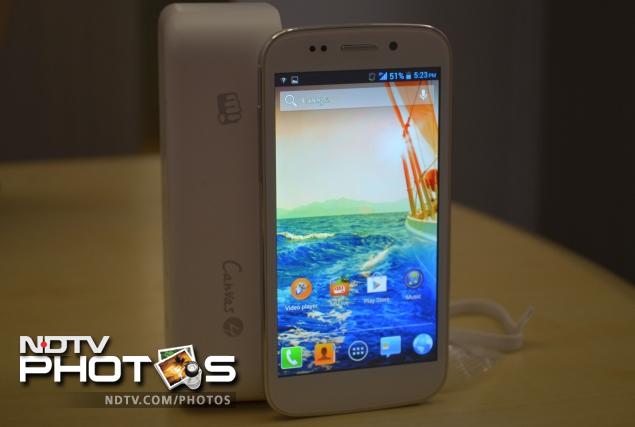
Micromax Canvas 4 (A210), the company created a lot of buzz, right from the promo teasers on TV during the high profile India vs. Pakistan clash in the ICC Champions Trophy to taking pre-orders for the phone without announcing its specifications. The Canvas 4 promises better build quality and new smart features but essentially builds on the Canvas HD, and includes almost the same hardware, under the hood. Does the phone live up to the hype around it? We try to answer this question in our review.

Build/ Design
The Canvas 4 follows the same design cues that we've seen in the Canvas HD and Canvas 2, and from a distance, the phone doesn't look very different.

On closer inspection you'll find that the phone looks a bit more polished than its predecessors, though it's still a little bit plasticky for our taste. The phone is available in White and Grey colour variants and we had a White Canvas 4 as our review unit.

Canvas4-blackandwhite.jpgThe front of the phone is dominated by the 5-inch display, below which you'll find the three capacitive touch keys for Menu, Home and Back. A chrome grill that serves as the earpiece, the sensor array and the 5-megapixel front camera are placed above the display. The bezel is wide but it's not flat as it meets and the edges and there's some embossing, similar to the Galaxy SIII.

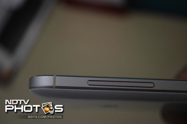
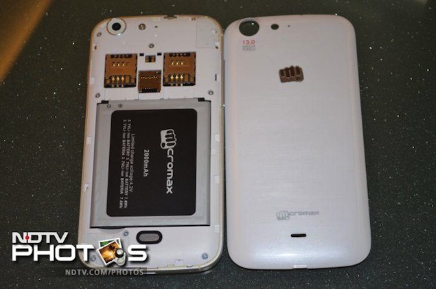
The phone is surrounded by an aluminium frame in the middle, which gives it a premium look and makes it feel sturdy. The company says that it also acts as the cellular antenna. You will also notice that the frame has small white bands at the left side, at the bottom and at the top.
The Power/ Screen-lock key is located at the right side of the phone, while the Volume rocker key is place at the left side. Both these keys are also made of metal but are a bit rickety as they are not firmly fixed. When you shake the phone, you'll also hear some sound coming from the same area due to their movement. The Micro-USB port is located at the bottom. The 3.5mm headset jack sits at the top of the phone.

micromax-canvas-4-side-01.jpgThe back features a removable plastic cover that sports a glossy finish but there's a mild texture effect as well, which you'll only see when you look closely. There's some Micromax branding at the lower part, and a silver sticker like m! logo as you go up. The 13-megapixel rear camera is located right at the top in a round chrome ring enclosure, along with an LED flash and a secondary microphone.

Opening the cover reveals the battery compartment. The microSD card slot and two SIM card slots are placed just above the battery compartment.

Display
While everyone was hoping that the Canvas 4 would come with a full-HD display, Micromax has decided to skip the upgrade and has included a 720p display, similar to that of the Canvas HD. The phone's 5-inch HD IPS screen sports a resolution of 720x1280 pixels and a colour depth of 16.7 million. Thanks to the higher resolution, text, icons and images look much sharper compared to qHD phones. There was no pixelation. However, we felt that the screen's colour temperature was skewed towards the colder side, with whites carrying a blue tinge.

canvas-4-horizontal.jpgUnder sun visibility was good, though the screen is very reflective. Thanks to the IPS panel, we found that the viewing angles were very good, which essentially means that more than one person can view content playing on the screen properly, even from different angles. We also found the touch response of the screen to be better than most budget phones. Micromax has also included Corning Gorilla glass protection to guard the screen from scratches.

Software/ Interface
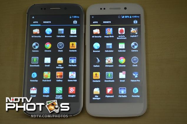
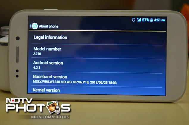
The Micromax Canvas 4 runs Android 4.2.1 Jelly Bean, the latest iteration of the OS. Micromax has skinned some elements of the user interface, such as the app icons and the Settings menu.

The phone also offers four themes, namely Mint, Mocha, Raspberry and the default theme that bring minor changes in the phone's colour scheme.

canvas4-UI-1.jpgThe notification tray features a settings shortcut and a clear all notifications button, along with expandable notifications (expanded with the two-finger pull gesture). It features the same setting toggles shortcut that's found in stock Android and adds some of its own as well, for quick access to Airplane Mode, Battery status, Wi-Fi, Bluetooth, GPS, Data connection, Data usage, User (audio) Profiles, Brightness, Screen backlight timeout and Auto rotation.

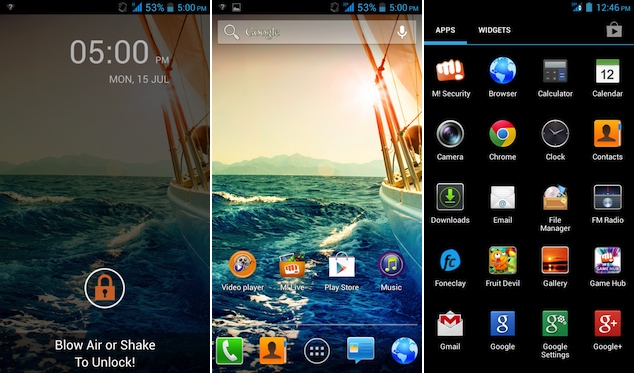
Similar to most other Android devices, there are five customisable home screens that can be filled with app shortcuts and widgets. The three capacitive buttons, Home, Menu and Back help in navigating through the phone, with the Home button also doubling up as an app switcher on long press.

canvas4-UI-2.jpgYou also get lock-screen widgets, an Android 4.2 feature. You can choose from the Clock, Camera, Gmail, Google Now and Messaging widgets in addition to widgets offered by third-party apps installed on your phone. These widgets offer glanceable information from the apps and allow users to perform certain app actions even when the phone is locked.

The phone also offers another Android 4.2 feature, Daydream, that displays photo albums or the clock while the phone's charging. The option to wirelessly mirror the phone's display with an HDMI enabled device through a wireless display adapter is also present.

Micromax has also added some software tricks to the phone, one of which is a new lock screen mechanism that allows the phone to be unlocked with a blow of air or if the phone is shaken. This can be activated through the M! Unlock app that has been developed in partnership with FoneClay. It works as promised but disables the lock screen widgets, so we just feel it's too gimmicky.

canvas4-UI-3.jpg
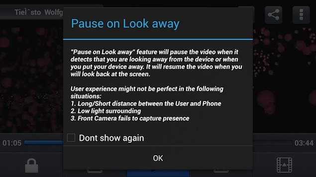
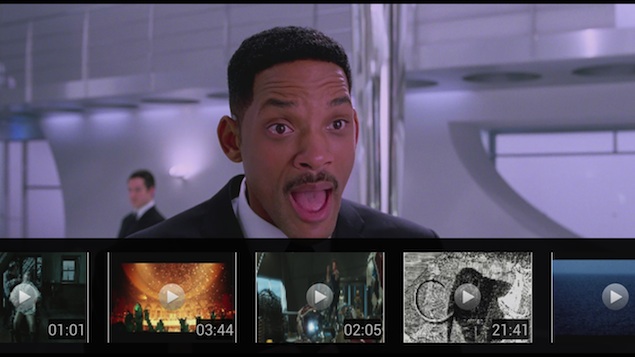
Micromax has also bundled a new Video Player app with the phone that offers features like 'Pause on look away' using the front camera to detect if you're looking at the screen of the phone, and automatically pausing and resuming videos. We've seen this feature in high-end phones like theSamsung Galaxy S4 and the LG Optimus G Pro. You can increase and decrease the volume or brightness while playing a video by just swiping up and down the screen at the left and right hand sides. It also allows you to preview one video while playing another one, and view videos on a floating player window while doing other tasks through its pop-out feature.

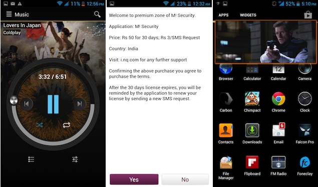
The Music player has also been revamped and now features fancier controls in the Now Playing screen and integrates the Micromax Online music store. The Music Store is still a website wrapped into the app and allows you to download music tracks and videos. It only lets you download tracks when you access the site through 3G/ Edge as billing is integrated with the telecom operator. The Music Player app also features Equalizer settings.

canvas4-UI-4.jpgMicromax has also included some of its own apps including content stores, M! Live and Game Hub, and services store, M! Zone, in addition to a few 'try and buy' games (Fruit Devil, NFS Shift, The DarkMan). There's also security software powered by NQ Mobile that allows you to backup contacts, and track your mobile in case you lose it. However, even this utility is not free and you need to pay additional charges to get all the functionality.

The handset also offers FM Radio and FM radio recording.

Micromax has also modified the Messages app, adding a Smileys input option next to the text entry prompt, and a button for attaching multimedia, contacts and audio clips, among others, with it. Micromax has also added a file manager app, a NoteBook app, a ToDo app, in addition to a universal search app and a Popup Browser that can be used for browsing the web in a floating window while working on another app. It has also replaced the stock camera app with a different one.

For the first time Micromax has replaced its own instant messaging app, HookUp with a Micromax branded version of Hike, the mobile messaging app from Bharti Softbank. It has also pre-installed the movie streaming app Spuul, that allows users to watch movies for free.

It's also worth pointing out that the Canvas 4 is the first Micromax smartphone that supports over the air software updates via a System Software app. Previously one had to take the phone to the service centre to get the latest Android update installed.

The phone also offers gestures like flip to silent, ability to answer the phone by bringing it near to the ear, and dial the number on the screen when the user brings the phone near the face.

Camera
The Micromax Canvas 4 has a 13-megapixel rear camera and a 5-megapixel front facing camera. Both the camera lenses are an upgrade from the Canvas HD's 8-megapixel rear shooter and VGA front facing camera.

canvas4-camerasmaple-1.jpgAs we mentioned earlier, Micromax has put its own camera app. The app includes Normal, HDR, Face Beauty, Smile detection, Exposure compensation, Panorama, Photosphere(multi angle view) modes. It also offers a burst mode, letting users click up to 99 shots at once. The photo mode allows users to modify settings like Exposure, colour effect, ISO and white balance, among others. There's a self timer of up to 10 seconds as well.

canvas4-camerasmaple-2.jpgWe experienced a minor lag when we tried to focus on an object and press the shutter. We also noticed that there is minor delay between two consecutive camera shots in the continuous shot mode. This makes it hard to capture images quickly. The quality of the pictures taken during daylight was decent. However, photos taken indoors under artificial light were a bit grainy and at times looked different than the actual setting. The camera tends to soften the tone to a cooler shade.

The Canvas 4's camera also struggled when trying to capture images in low-light.

canvas4-camerasmaple-3.jpgThe camera is capable of recording full-HD video and takes good quality videos depending on the ambient light. However, it saves video clips in .3GP file format, which is an older file format.

The 5-megapixel front camera takes above average pictures, and can be used for video conferencing. We wish the phone had a dedicated camera button to help click a quick picture.

Performance
The Micromax A210 Canvas 4 is powered by a 1.2GHz MediaTek MT6589 quad-core processor with 1GB RAM onboard, and PowerVR SGX544MP GPU. There is 16GB of internal storage, 10GB of which is available to the user.

With Android 4.2 Jelly Bean, the overall experience of navigation through the interface was impressive, thanks to Project Butter and the phone's quad-core processor. We did not experience any lag while launching apps, playing games, scrolling web pages or switching between apps. It is safe to say that performance wise, the Canvas 4 scores well. We were able to play games like Jetpack Joyride, Chimpact, Asphalt 7 and Shadow Gun without encountering any lag.

We were also able to play full-HD clips, with the phone supporting formats like .AVI, natively, though we experienced some issues with audio while playing an MKV format video. This was easily fixed by downloading a third-party video player. The speaker on the phone delivers average quality sound at high volume levels, but there's some muffle when the phone lies on its back, as the speaker grill is located on that side. The headphones that come with the phone offer average quality sound output. Call quality was good, during our testing process.

micromax-canvas-4-cover.jpgThe phone comes with a 2,000mAh battery, and based on our experience, it will just about last you a full day. We charged the phone in the morning (at around 10am), and with medium to heavy usage, including 1-1.5 hours of phone calls, two e-mail accounts with push notifications, screen at maximum brightness, playing some music and video clips (about an hour), casual web browsing, Twitter notifications and WhatsApp chats, the phone lasted 8-9 hours. We had put the phone on Wi-Fi for about an hour or two while the rest of the day it was connected to data via 3G. We had turned off auto-brightness, and the phone was on the highest level of brightness. Altering these settings might help in running the phone for a longer duration, depending on your usage pattern.

Verdict
The Canvas 4 is at best an incremental upgrade to the Canvas HD. Apart from the 'better camera' which we didn't find any better and slightly improved build quality, it doesn't bring anything extra ordinary to the table. The software features that it offers are gimmicky and can be added with the help of some third party apps available on the Google Play Store. You are unlikely to use them on a regular basis. The only thing we're happy about is the increased internal storage capacity, which will allow users to install more apps.

The asking price of around Rs. 18,000 is on the higher side when you compare it to the Canvas HD or to phones like the Zen Ultrafone 701HD and Gionee Elife E3. We'd recommend waiting for a price cut or buying the Canvas HD if you're in the market for a good value for money Android smartphone.

 
Micromax Canvas 4


Price: Rs. 17,990

Pros
  • Good screen
  • Decent performance
Cons
  • Questionable value for money
  • Underwhelming build quality
  • Camera performance could be better

Ratings (Out of 5)
Design: 3.5
Display: 4
Performance: 4
Software: 4
Battery Life: 3.5
Value for Money: 3
Camera: 3
Overall: 3.5

Sony Xperia Z Ultra with 6.4-inch full-HD display now available online for Rs. 44,990


sony-xperia-z-ultra.jpg
The Sony Xperia Z Ultra smartphone, which had been listed as 'coming soon' on online store Saholic, a day back, has now got a price tag of Rs. 44,990.
The listing promises a delivery time of 7 days for Delhi PIN-codes, so it's likely that Sony might make an official announcement within this week. It also bundles a 16GB memory card with the phone.
The Sony Xperia Z Ultra sports a sleek look with a thickness of 6.5mm, and weighs 212 grams. It features a 6.4-inch full-HD display with a resolution of 1080x1920 pixels and boasts of Sony's proprietary BRAVIA Engine 2. It is powered by a 2.2GHz quad-core Qualcomm Snapdragon 800 processor coupled with 2GB of RAM. It offers 16GB of internal storage that can be expanded up to 64GB via microSD card. The Xperia Z Ultra sports an 8-megapixel Exmor RS rear camera and a 2-megapixel front facing camera. The device includes LTE, NFC, Wi-Fi, 3G, DLNA and Bluetooth connectivity options. It has a 3000mAh battery that Sony claims could deliver up to 14 hours of talktime and 768 hours of standby time.
Just like the Xperia Z and Xperia Z Tablet, the Xperia Z Ultra is also dust and water proof and comes with IP55 and IP58 certification. The Sony Xperia Z Ultra comes with handwriting recognition support and the device's screen can work with a pencil or a stylus/ pen that has a tip of more than 1mm(in diameter). It also comes with new and updated Sony Media Applications that include apps like Walkman, Movies and Album.
Last month, the company announced the Xperia Z Ultra for select markets and it was expected that the phone would be globally launched in Q3, 2013.
Meanwhile, Sony introduced the 'Big Xperia Xchange' offer that includes a minimum assured discount of Rs. 5,000 when customers exchange their old smartphone for a Sony Xperia Z or Xperia ZL.
It's worth mentioning that Sony has not officially confirmed the pricing of the Sony Xperia Z Ultra. It has also not shared any information on the availability of the phone.

Mobiles launched in July 2013

Sony Xperia Z Ultra key specifications
  • 6.4-inch TFT Triluminos display with a resolution of 1080x1920 pixels and Shatter proof sheet on scratch-resistant glass
  • 2.2GHz Qualcomm Snapdragon 800 quad-core processor
  • 2GB RAM
  • 8-megapixel rear camera with Exmor RS sensor
  • 2-megapixel front facing camera
  • 16GB internal storage expandable up to 64GB via microSD card
  • Android 4.2 Jelly Bean
  • LTE, NFC, Bluetooth, Wi-Fi
  • 3000mAh battery

Friday, 28 June 2013

MacBook Pro with Retina display


macbook-pro-with-retina-display.jpg

When I was 13, I was sent to the optician for the first time, and came home with glasses. Suddenly, the world was sharp all around me. I was surprised by the crisp lines of the tree branches against the sky. It was news to me that I was near-sighted, because I had been used to seeing the world in a blur.Apple Inc. sells a similar epiphany, starting this week, in the shape of a notebook computer. One of its new MacBook Pro models has a "Retina" display, a screen that packs four times as many pixels as a standard display.
Why is this a big deal? It's not easy to describe in print, but a look at the screen tells the whole story. It's like putting on glasses and realizing you're nearsighted. Much like the screen on the latest iPad, the new display makes all other screens look dull and fuzzy.
Even the icons on the Mac screen look so much more detailed. On the calendar icon, you can make out the dots for the individual dates. On the Address book, you suddenly see that the "at" sign on the cover is embossed.
High-resolution photos look really, really sharp. Low-resolution photos, like those on Facebook, are revealed as mushy and indistinct.
With a resolution of 2,880 by 1,800 pixels, the Retina screen can show every pixel in a five-megapixel shot, all at once. It has more pixels than a high-definition TV set - 2.5 times as many.
As you might expect, this epiphany doesn't come cheap. The MacBook Pro with Retina display starts at $2,199.
That's nearly three times more than the average consumer spends on a laptop, but it isn't a bad price for the video editors, photographers and graphic designers who are the intended buyers.
In fact, the new MacBook looks like a steal compared to a regular, non-high-resolution MacBook with a screen of the same size, at 15.4 inches diagonally. When a regular MacBook is upgraded with the 8 gigabytes of RAM and 256-gigabyte flash-based "hard drive" that come standard on the Retina model, it costs $2,399. So you're basically saving $200 by getting the better screen.
There are a few other differences between the Retina MacBook and the regular one. It's thinner, lighter and lacks a DVD drive. It even lacks an Ethernet port for Internet connections. This was a problem as soon as I unpacked the unit, because getting on the office Wi-Fi can be troublesome. Apple sells a $29 Ethernet adapter that plugs into one of the two high-speed, multi-purpose "Thunderbolt" ports. It would have been a nice gesture for them to include one in the box.
If the stripped-down features of the MacBook Pro remind you of something, it's probably the MacBook Air, that ultra-slim laptop Apple first released in 2008. Many who saw it then recognized it as the future of laptops, and the new MacBook Pro is the proof of that prophecy - in many ways, it's a super-sized MacBook Air.
The MacBook Pro is just 0.7 inches thick. That's the same as the Air at its thickest point, but unlike the Air, the Pro doesn't taper into a wedge shape. It's the same thickness all the way through, making it feel a lot more substantial than the Air.
The screen is partly to blame for this. That's because the sharper screen is also darker. To get it looking as bright as other laptops, Apple has to pump more light through it. More light takes more power. To get the Pro to last for about seven hours of work (a claim I did not have time to test), Apple had to increase the size of the battery. It takes up nearly half of the internal space of the laptop.
I suspect the Retina screen is coming first to a relatively big MacBook because its chassis provided Apple with the space to expand the battery. In a MacBook Air, there's no space for a bigger battery, so a Retina screen would have meant shorter battery life. That would have been a tough sell.
I hope Apple or another manufacturer figures out a way around the battery issue, because I want to see this type of display in every device. Of course, desktop displays aren't limited by power consumption in the same way, so we can hope to see super-resolution monitors soon. It's time for our computers to give us glasses

Sony Cybershot DSC-WX300 review


Sony_WX300_Review_01_174613_134653_5342.jpg

Point-and-shoot cameras are at an interesting place. Many believe that point-and-shoot cameras will soon be replaced by smartphones that have very capable cameras, and the likes of iPhone 5, Nokia Lumia 920 and others are proof of this trend. However, one advantage that point-and-shoots continue to have over smartphones is optical zoom, and having a huge optical zoom can indeed be of great use.Sony likes to call the Cybershot DSC-WX300 the smallest point-and-shoot camera with a 20x optical zoom, and on it's own the camera indeed looks tiny. Let's take it for a test and see what it holds.
In the Box
  • Sony Cybershot DSC-WX300 camera
  • Manual
  • Warranty card
  • Power cable
  • USB charger
  • USB cable for charging
  • Hand strap
  • Battery
  • HDMI cable
  • 4GB memory card
Build/ Design
The Sony Cybershot DSC-WX300 is a small little camera when you hold it in your hand, but the moment you put it next to another point-and-shoot you realise it is not as small as it initially seems. Having said that, you have to admire the work of the Sony design and engineering team for managing to put a large 20x optical zoom into such a small body.
The camera fits nicely in the hand and the rounded edges make it easy to hold. The controls are easy to reach and comfortable for one-handed use. The back of the camera is taken over by a huge 3-inch LCD that is nice and bright both indoors and outdoors. The LCD is not a touchscreen but shows all the information you need. It is also a bit of a fingerprint magnet, as one cannot avoid touching the screen at times and needs to be cleaned frequently.
Sony_WX300_Review_02_174613_134653_4482.jpgThere is no rubber padding for the grip and at times I did feel that the camera was slipping out of my hands, but thanks to the hand strap around my wrist I knew I would not drop it.
The memory card and the battery other go under the camera, adjacent to the HDMI port. There is a multi-function Micro-USB port on the right hand side for charging as well as transferring data.
The WX300 has a built-in flash at the front of the camera, stereo microphones on the top of the camera and uses a USB based charger that relieves you of carrying a spare charger too. It's good to see that Sony includes an HDMI cable with the camera.
If you are interested in using the camera with a tripod, it's worth pointing out that with the lens fully out, the camera falls over when kept on a flat surface. Thus, if you are looking to shoot at full zoom, you are advised to carry a full-sized tripod and something like a GorillaPod won't do.
The camera is available in four colours and we tested the Black one.
Sony_WX300_Review_07_174613_134653_1362.jpgFeatures / Performance
Sony Cybershot DSC-WX300 does not feature any manual controls like most other point-and-shoot cameras. It comes with eight preset modes that you can choose from, selectable via a rotating dial. The dial lets you choose between a Scene mode, a Background defocus mode (ideal for clicking portraits), an Intelligent Auto mode (indicated on the dial in green), a Superior Auto Plus mode, Program Auto mode, rama mode, Movie shooting mode and a 3D mode.
The Scene selection mode features further sub-modes based on the type of picture you are trying to click including Soft Skin, Gourmet (for food shots), Night Scene, Landscape, Snow, Fireworks and more. The Intelligent Auto mode is the one you would use on this camera to take most of your pictures. If you use the Intelligent Auto+ mode, the camera takes multiple shots and overlays them giving you a picture that's a bit more saturated but appears nicer to the naked eye, especially if you are shooting in a dimly lit room. However, for me this was a complete no-no, as most pictures ended up loosing details.
The Panorama mode on the WX300 is very well implemented and it takes a panorama beautifully, unlike it's predecessors where the camera kept constantly reminding you to go slow or go fast. With the WX300 one just sweeps through and gets the work done, and was so much fun that I ended up shooting quite a few panoramas.
Sony_WX300_Review_04.jpgNext to the mode dial on the top of the camera is an aptly sized shutter button with a toggle zoom control. The button is placed well and right next to it is the power button that is recessed so you don't hit it accidentally when clicking a picture, or when someone else is taking a group shot for you.
The camera has no manual controls, be it for focus or for shutter/ ISO so if you are an advanced user you may find this restricting. I did not miss these controls during the time I spent with the camera.
The WX300 comes with built-in Wi-Fi, which means you can set it up a secure Wi-Fi hotspot so your smartphone and tablet can connect to it. You can then use the display on your phone or tablet as a viewfinder and trigger a shot. This is especially useful in case you are taking a self-portrait or a shot at a difficult level. Unfortunately, the app is available only for Android phones and tablets, and not iOS. You can also transfer pictures from the camera to your computer, mobile or tablet over Wi-Fi.
Focus System
The auto focus on the Sony Cybershot DSC-WX300 works quite well, though it has its limitations. For example, if you are shooting an object or a person at full zoom, it seems to be a bit slow and takes its time, but in almost all other conditions its quite responsive. The tracking focus function works both in still mode as well movie mode.
One drawback in the camera is a lack of macro mode, so if you like shooting flowers or other objects up close, you will be disappointed.
Sony_WX300_Review_05_174613_134653_2772.jpgImage Quality
The WX300 uses Sony's Exmor R back-illuminated 18.2-megapixel CMOS sensor. This gives it great agility when it comes to taking pictures both indoors and outdoors. Add the fact that the camera is small enough to carry in your pockets all the time, and it manages to become your great field companion.
The camera performed pretty well when it came to taking self-portraits and pictures of other people at night and focussed pretty well. The flash on the camera does not need to be popped, just enable or disable it from the menu before taking the shot. The flash on the WX300 is quite strong and some of the scenes end up with too much light and loosing their appeal. But in most cases the flash does a good job overall. However, thanks to the good sensor inside the WX300, you may not need the flash on many occasions.
The low-light images appear sharp and crisp. As I mentioned earlier, there are no manual controls on the camera, so I was slightly worried that the night scene pictures may come out grainy, but I was pleasantly surprised to find them sharp enough.
Sony_WX300_Review_03_174613_134653_3842.jpg
The powerful 20x optical zoom on the Sony Cybershot WX300 in action. The image above is clicked at full zoom with the inset of the traffic cop taken at 20x optical zoom from the same spot.The full-zoom pictures also came out nice (see sample shots above and in the gallery). The body's built-in image stabilisation is pretty accurate for a camera this small.
The WX300 also has a 10 frames-per-second mode, and it manages to capture an action scene pretty well. Though Sony claims that the resultant images are full-resolution, I felt that some details were lost in the high-speed mode.
To put the camera through a tough test, I took a night-shot of a backlit taxi sign. Though the picture came out very sharp and crisp, I noticed a shift in colours. While, this can always be corrected during post-processing by changing the temperature of the image, I was slightly surprised that this happened in a camera that produced otherwise accurate colours.
Sony_WX300_Review_06_174613_134653_2072.jpgVideo
The video mode is pretty well-executed and the camera is capable of taking full-HD videos. The WX300 has a very sensitive set of microphones, which is generally a good thing as it picks up even minute sounds, but if you are in a very noisy environment, it can work against you.
The videos taken with the camera are sharp and full of details, and, as you would expect, it is also possible to capture stills while recording video. The tracking focus and zoom capabilities work well to give you a blur-free video.


Battery Life
The Sony Cybershot DSC-WX300 has a small battery and the entire package (battery + camera) weighs just 166 grams. Looking at the size, I was worried if the camera would be able to last an entire day, but that fear was unfounded as I could shoot an impressive 300 shots, including a few panoramas and a video, on a single charge. As mentioned, you can charge the camera over USB, which means should it run out of juice, your mobile charge can perhaps double up as a charger for the WX300.
Verdict
Overall, the Sony Cybershot DSC-WX300 is quite impressive with good image quality and a 20x optical zoom that lets you click some interesting pictures. The lack of manual controls bothered me personally, but the target audience of the camera won't mind it as much. The lack of iPhone app to go with the Wi-Fi features of the camera might limit the camera's appeal as well


Price: Rs. 19,990
Pros
  • Powerful and sharp zoom
  • Good quality images and video
  • Built-in Wi-Fi

Cons
  • Slightly slow autofocus at full zoom
  • Missing macro detection in auto mode
  • No rubber grip for thumb rest
  • No iPhone app
Ratings (Out of 5)
  • Build/ Ergonomics: 3.5
  • Features / Performance: 4
  • Image Quality: 4
  • Video: 4
  • Battery Life: 4
  • Value for Money: 4
  • Overall: 


Sony launches SmartWatch 2, a 'second screen' for Android smartphones


sony_smartwatch2_good.jpg


sony_smartwatch2_good.jpg

Sony has officially launched SmartWatch 2, the successor to its SmartWatch.
Sony SmartWatch 2 comes with a bigger 1.6-inch screen with higher resolution 220x176 pixels resolution, compared to the 1.3-inch screen 128x128 display on its predecessor. Sony is positioning the watch as a second-screen for your Android smartphones, letting you receive notifications from the phone as well as control its functionality.
SmartWatch 2 makes it possible to access notifications from your wrist such as messages, calls, email, Facebook or Twitter, Calendar, or use it as a remote for your Walkman or other digital media player. The SmartWatch 2 comes with a bunch of pre-installed apps, with an option to load other apps as well.
Other things you can do with the SmartWatch 2 include:
  • Take a photo remotely from your SmartWatch, using a smart camera app.
  • Control your presentations remotely using Presentation Pal.
  • Taking a run or on the bike? Select a mapping app on SmartWatch to check your route with a quick glance at your wrist.
  • Read previously downloaded e-mails when not connected to your phone.
  • Use lifestyle apps like Runtastic to map and instantly track your fitness activities on the go.
  • Quickly adjust the tracks and volume on your music player.
Sony SmartWatch 2 comes with NFC connectivity and can be charged via a standard Micro-USB cable. It is water-resistant (IP57) and users can customise it by using any standard 24mm strap.


Sony SmartWatch 2 technical specifications
  • Works as an NFC watch with all smartphones using Android 4.0 (Ice Cream Sandwich) and later
  • Battery time - Low usage 7 days, Normal usage, 3-4 days (Watch always on)
  • Bluetooth 3.0
  • Android release: 4.0 and later
  • Charging with micro USB
  • Transflective LCD 1.6", pixels: 220x176
  • Languages: English master, Chinese (Trad), Danish, Dutch, English, French, German, Greek, Japanese, Portuguese, Czech, Russian, Polish, Spanish & Swedish.
  • Apps/plugins ready-to-go: App recommender, Facebook, Twitter, SMS, MMS, Missed call notification, Calendar notification, Email, Google+, New events - aggregator, Missed call, RSS, Gmail, Viewfinder (remote camera shutter), Phonebook, Music player, Find phone, Call log, Weather, Time, date.


Samsung Galaxy NX mirrorless camera press shots leak


Samsung_Galaxy_NX.jpg

There have been news reports suggesting that Samsung will be revealing its Galaxy Camera 2 at its "Samsung Premiere" press event being held on June 20th. Recently some leaked images of this camera too were leaked online. Just days before the camera is due for an official release, its press shots too have been spotted online. The photos have been posted on Vietnamese website camera.tinhte.vn, which claims that this camera will be dubbed Galaxy NX. If these leaked pictures are indeed true, then the Samsung Galaxy NX has very little resemblance to the existing Samsung Galaxy Camera.
Furthermore, Galaxy NX is also bigger in size than any other mirrorless cameras that Samsung is currently offering. From the leaked images, it also appears that the Samsung Galaxy NX camera will have no physical buttons. It is also likely to come with a 4.3-inch touchscreen with qHD display.
Samsung Galaxy NX camera is expected to come with 20.3-megapixel APS-C sensor and will support full-HD video recording. The camera is expected to be running on Android 4.2.
Internally, Samsung Galaxy NX will pack in Samsung's Exynos 4 quad-core processor along with 2GB of RAM. The camera will either offer 8GB or 16 GB of internal storage.
From the leaked press shot, it also appears that Samsung will be offering at least three compatible NX lens options for its Samsung Galaxy NX camera.
So far there is no word on when this camera will start retailing and what could be its tentative price.
Samsung is expected to unveil new Galaxy and Ativ devices on June 20 in London. 

Samsung rolls out first curved, super-thin OLED television for $13,000

Samsung Electronics Co Ltd slapped a $13,000 price tag on its first curved, super-thin OLED television to go on sale, the same price as rival LG Electronics Inc and one that underscores the high costs of the technology.
Samsung is hoping that its success with OLED screens in smartphones such as its Galaxy S4 will also pay off in TVs, but consumers interested its 55-inch screen television must be willing to pay some five times more than popular flat-screen equivalents.
At the moment, OLED televisions are still very much a niche market and Samsung warned that industry forecasts for sales growth were a bit too optimistic.
"We have just introduced our first OLED TV and have to see consumer response to gauge overall market demand," Kim Hyunsuk, a Samsung executive vice president, told reporters.
Research firm DisplaySearch has forecast global industry-wide sales of OLED televisions at 50,000 this year, at 600,000 next year and rapid growth thereafter to reach 7 million in 2016.
LG, which currently offers both curved and non-curved 55-inch screens, is estimated to have only sold a few hundred screens so far after starting sales earlier this year.
Samsung said it will begin selling its curved OLED television outside South Korea from July but did not specify which countries. It has no plans to offer a non-curved one this year.
Organic light-emitting diode technology has long been touted as the future of consumer electronics displays, offering crisper picture resolution, a faster response time and high contrast images. It also allows for curved televisions, which manufacturers say offer a more immersive TV experience.
Both Samsung and rival LG Display, a unit of LG Electronics, have invested heavily in OLED, seeking to emulate the success they had with LCDs, which helped them squash Japanese rivals such as Sony Corp and allowed them to capture coveted roles as suppliers for Apple Inc.
Samsung is now the world's biggest TV manufacturer, and the South Korean duo now sell almost half of all TVs worldwide.
Not one to put all its eggs in one basket, Samsung also unveiled on Thursday 55-inch and 65-inch ultra-high definition (UHD) TV sets, which offer crisper LCD picture resolution.
Ultra HD TV sales are likely to grow 930,100 this year from 9,600 last year and may jump to 3.9 million sets next year, according to DisplaySearch.
© Thomson Reuters 2013

LG to start mass-production of flexible displays this year

Flexible OLED displays may come to a screen near you sooner than imagined.
According to a report by The Korea Times, LG Display will be manufacturing flexible display panels for major smartphone producers starting fourth quarter of this year.
LG's Frank Lee told the publication that LG had completed the development of its first flexible displays and would be mass-manufacturing them from the fourth quarter.
The displays will be based on organic light-emitting diode (OLED) panels and would offer an ultra-high definition (UHD) resolution also known as 4K. Apparently, the company's E2 line at its display complex in Paju will be used for the production of these displays.
Flexible displays are thinner, lighter and more durable when compared to the presently popular glass displays. These also happen to be much more impact resistant.
According to the report, LG Electronics plans to release the first flexible display smartphone later this year.
Samsung had showcased its flexible display technology at CES 2013 with its OLED Youm Display. The company had also shown a functional prototype of a flexible display smartphone. So clearly, flexible displays happen to be underway from Samsung as well. But the question is whether LG will beat Samsung to it. Based on the reports so far, LG does seem a plausible candidate to bring the first flexible display to the mass consumer market.
LG and Samsung are already offering curved OLED televisions. The technology offers better viewing angles and a better overall experience. Company officials told The Korea Times that LG would expand this OLED portfolio to 65-inch and 77-inch panels as well.

Review: Sennheiser HD598


sennbeige.jpg

Famous for it's quality headphones, Sennheiser offers a range of products that suit a variety of pockets. Prices range from affordable to insane - like the HD 800 (read review here). But this review is about the HD 598 which claims to offer high caliber sound at a lower price. Just how high caliber is what we intend to find out here.


Build and Design

The HD 598 is of Sennheiser's usual high quality. Unlike most headphones in the market, the HD 598 is offered in beige, which makes it stand out in comparison to its peers. Cool quotient apart, critics will carp about the colour's tendency to show dirt.

On the whole, the construction of the HD 598 reminds us of a D-segment vehicle - those beige plastics, leather upholstery and faux wood bits! It's like Sennheiser got Toyota on board to help choose the colour palette.

The headband of the headphone offers cushioning, which is covered with a faux leather layer.

All these elements give the HD 598 a love it or hate it quality. While we loved it many people in our office were not that impressed.

Generally, looks are pretty subjective and the same holds true for the Sennheiser HD 598. Looks apart, the general build of the headphones feels pretty solid.

As impressive as the build quality is the fact that the headphones are extremely light and weigh only 9.5 ounces. We could hardly feel them on.

The ear cups were large and cozy. They were made up of micro-fiber like material with a decidedly velvet-like feel.

Besides this, Sennheiser also provides a 10-foot long cable which is user replaceable. The 6.3mm jack is gold plated but Sennheiser provides a neat 6.3mm to 3.5mm adaptor, which fits perfectly unlike the cheap Chinese adaptors that are available in the grey market.

Sound Quality
The Sennheiser HD 800, which we tested for a week or so, is certainly the gold standard of headphones but unaffordable to most at a hefty price tag of Rs 78,000. In comparison, the HD 598 aims to provide quality sound to the masses at Rs 12,500. It may not sound as epic as the HD 800 but, for the most part, it is good value for money producing lush, warm and balanced sound.

How to does it achieve this? Quite simply, by borrowing a lot of technology from the exalted HD 800.

Like it's big brother, the HD 598 gives a sense of immense space and the feeling that the sound is coming from the front, rather than the back. This happens thanks to Sennheiser's Ergonomic Acoustic refinement technology, which made its debut on the HD 800.

To add to rich mid-range we also get neodymium magnets, Duofol drivers and ultra lightweight aluminum coils.

Sound quality-wise, the HD 598 holds its own against the competition. In comparison to the Dr. Dre Monster Beats, the HD 598 provides a more soothing aural experience. While the Beats offers a gargantuan low-end thump, the Sennheiser HD 598 provides a more balanced sonic quality as it focuses on the whole sonic spectrum equally. It is also very impressive in comparison to the Skull Candy Aviators as it provides a richer sound.

Another impressive feature is the 50 ohms impedance, which is more than adequate to power the speakers via an iPod, though for a true sound test its always advisable to check the headphones through high quality amplification.

For our tests we plugged the headphones into our M-Audio Pro-fire 610, which provided an incredible boost to the sound output.

Our usual starting block is Sweet Child O' Mine which is well known for its sweet harmonic mid range response. Slash's searing lead riff is the signature sound of the song but often most headphones struggle to replicate the intended harmonic overtones. The HD 598 reproduces this particular facet of the sound with a great deal of panache. The vocals were crisp and the bass was pretty substantial. On the whole, it was a pretty satisfying experience.

Next up on our test list was power ballad Breathe Again by Alter Bridge. This song sounded absolutely beautiful on the HD 598. From the baritone vocals of Myles Kennedy to the shimmering chords of Mark Tremotti, everything sounded balanced. We must admit the sound was a tad shriller than on the Bowers and Wilkins P5, but on the whole it was very impressive. We must also note that the Bowers and Wilkins P5 headphones are a good 6K more expensive.

Now we decided to test some progressive metal in the form of Tool's Sober. Normally, the harsh sound of metal induces clipping and the HD 598 was no different as on maximum volume levels clipping was very evident. Having said this, we must also point out that the moment we rolled the volume down the song sounded fantastic. The chugging riffage of Adam Jones was heavy yet detailed, the oddly timed drum rolls of Danny Carey were crisp and Maynard Kennan's vocals were haunting. Overall, the song maintained immense clarity once the volume was rolled off.

From the word go, the Sennheiser HD 598 sounded very sweet and on the whole the headphones performed very well. While we missed the audiophile grade flat response, the colored sound for the most part delivered a thoroughly enjoyable listening experience.

Verdict
With its balanced sound and comfortable fit the HD 598 is one of the better headphone offerings currently available in the market.

While the sound is definitely colored, it is also more balanced than its competitors. These headphones are not aimed at audiophiles demanding sonic perfection but at those who just want high quality audio. They are worth every penny of the Rs 12,990 price tag.

Pros
Balanced Sound Quality
Comfortable design
Long cable

Cons

Clips at high volumes
Beige color may not suite everyone
Slightly expensive

Ratings:

Price: 3
Ergonomics: 4
Performance: 4
Wow Factor: 4

Temple Run for Windows Phone 8 updated to work on devices with 512MB RAM


temple-run-for-windows-phone8-635.jpg

Popular "endless running" game, Temple Run, which debuted on Windows Phone 8 earlier this year, has now been updated to support phones with 512MB RAM.

While there's no official change log on the game's listing page on the Windows Phone store, the game's developer, Imangi Studios, talked about the update through its Twitter handle.
Temple Run for Windows Phone was criticised for its hardware and software requirements, namely, 1GB RAM and Windows Phone 8, which meant that the game could be played only on a handful of phones - HTC 8X and Nokia Lumia 820, Lumia 920 and Lumia 925 - could play the game. Users running an older version of Windows Phone, or having lesser RAM on their phone were left high and dry.

While the game is still limited to Windows Phone 8, the developer of the game, Imangi Studios, has now optimised it to run on phones with 512MB RAM. Following the move, a large number of users would be able to play the game as Nokia's recently launched entry and mid level Windows Phone 8 handsets such as the Lumia 520, Lumia 620 and Lumia 720 come with 512MB of RAM. The HTC 8S mid-range Windows Phone 8 smartphone also comes with 512MB of RAM.

However, at the time of writing this post, we were not able to find the game on the Windows Phone Store while using the Nokia Lumia 520. We also tried opening a link to the Store via Internet Explorer and encountered the same "This app uses features your phone doesn't have" error that we used to get earlier. Perhaps this could be due to the update not being rolled out to the Indian store at the time of writing this post.

The launch of original Temple Run on Windows Phone 8 arrived after Imangi Studios released multiple successors to the game on various platforms. Biggest success on those has been Temple Run 2, that became the fastest growing mobile game of all times, when it clocked over 50 million downloads in just 13 days. We'd look forward to the developer porting other versions of the game to the Windows Phone platforms

Google Earth for iOS update brings Street View support, updated search and 3D directions


Google-earth.jpg

Google has updated its Google Earth iOS app bringing new features including Street View support and improved directions and search features, in addition to an enhanced user interface.

The Street View feature allows users to view and navigate street-level imagery in a manner similar to that of Google Maps. The feature was already present in the Google Earth desktop app and made its way to the Android app last month.

The updated app also offers transit, walk, bike and driving directions in 3D and updated search that allows users to browse results quickly. Updated directions let you visualise transit, walk, bike and drive directions in 3D while update search result list will let you browse search results quickly.

It's worth noting that not all features are available in all regions, and indeed the Google Earth app itself  is not available in the India App Store. Even if you download it through another country's App Store, the app doesn't offer Street View or directions for Indian locations.

The also offers a new slider menu at the left that allows users to browse and enable different layers.

Google has also announced that it's pushing cloud free satellite imagery in Google Earth and Google Maps. The new satellite imagery can be seen by turning on satellite view in Google Maps and by zooming out while accessing the Google Earth app.

The update also features refreshed imagery for some new regions of the world, especially where high-resolution imagery was not available, including parts of Russia, Indonesia, and central Africa. 

GOOGLE NOW VS IOS SIRI

Google Now is often compared with the Siri voice assistant on Apple's mobile devices, but its power lies in giving you information you need to know before you have to ask. It works best as a supplement to Siri, rather than a replacement, now that it has expanded from Android devices to iPhones and iPads.
Both Google Now and Siri will respond to voice commands, whether it's to look up the day's weather or set the alarm on the phone. Google Now goes further in filling your phone screen with boxes containing stock quotes, sports results, weather, travel directions and more - all without making a request.
Those choices are based partly on your location, the entries in your calendar and the travel-confirmation messages in your Gmail account. To use Google Now, you have to give Google permission to use your personal data. You can create a separate Google account if you're not comfortable with that, though Google Now works better the more it knows about you. It works best if you also let it record and analyze the Google searches you've made recently.
For the past several months, I've had a chance to use Google Now on Android in 13 states and in Thailand. I've found it particularly useful while traveling. As soon as my plane landed in Orlando, Fla., on a trip this year, Google Now offered "cards" with details on my hotel and my car rental, based on confirmation emails sent to my Gmail account. Clicking the hotel card got me turn-by-turn directions to the hotel using the Google Maps app. On the way home, Google Now gave me the gate number for my connecting flight in Charlotte, N.C., as the first plane taxied from the runway.
Now, iPhone and iPad owners can get that, too. Google Now became available on Apple devices this week. Simply download the free Google Search app through Apple's app store.
For the most part, the Apple and the Android versions are similar in terms of the information they present.
But Google Now isn't as seamless to use on the iPhone or the iPad, mainly because Google doesn't have as central a presence in Apple's iOS operating system. On an Android device, clicking a Google Now card will often take you to a built-in Google app such as Google Maps or Calendar for more details. On the iPad Mini I tested it on, I got Web pages - at least until I manually installed Google's mapping app.
Google Now also isn't as easy to get to on the Apple devices. Holding the home button a second or two gets you Siri. Just speak to her with your question or search request. To use Google Now as a voice assistant, you need to open the Google Search app, and then tap on the microphone icon. Sometimes, you need to tap on the search box in the app for the microphone to appear. That microphone is sometimes on top, sometimes at the bottom or sometimes on the on-screen keyboard. (There's no home button to quickly get Google Now on Android, but you can skip one or two steps by finding the microphone on the top right of the home screen.)
To be clear, Siri is the better of the two - as a voice assistant. She'll always respond with something, even if it's to seek clarification. Google Now will often remain silent, sometimes giving you no more than a list of websites. Google Now's assistant also lacks Siri's feistiness and sense of humor. Siri, for instance, has more than a dozen witty responses to queries about the meaning of life. I compared the two for a review in March, so I won't dwell on that here.
Where Google Now shines is in anticipating your questions. Open the Google Search app, and you'll see cards fill the screen with useful information.
In Orlando, Google Now continually offered directions to nearby breweries, possibly because I had searched Google for information on tours. I got information on a co-worker's flight from Las Vegas because he had shared his Google calendar with me. And because I had searched for Flowers Foods for a story just before my trip, Google Now offered me directions to the baking company's headquarters in Georgia when I was about a half-hour away. I was actually headed to Montgomery, Ala., but I appreciated the gesture.
Later, in Bangkok and southern Thailand, Google Now was by my side with information on currency-exchange rates, language translations, tourist attractions and photo opportunities. It also told me the current time at home in New York, so I didn't need to figure out time zones myself.
On weekday mornings in New York, Google Now sends me notifications on how long my commute should take, based on public transit schedules at that time. It tells me about my commute home in the afternoon. It knows not to bother me with that information while I'm abroad.
Without typing or saying anything, I can press the search box on my phone and automatically get a card with the current weather and forecast. I can also get the latest Mets and Nets scores that way.
Google Now's judgments on what information I need to know can be sketchy at times
  • Although I thought the offer for directions to Flowers Foods was clever, I got annoyed with Google Now in Bangkok when it continually gave me directions to places I had searched but wasn't interested in visiting.
  • Searching for a company on Google often resulted in stock quotes on that company for a day or two, even though I don't own any stocks.
  • When I'm near a Barnes & Noble, I often get a card saying I could research products there. Clicking on the card gets me a link to the retailer's website and a chance to "Scan for product information." There was a camera icon, so presumably I could photograph a bar code or other identifier. It's not clear why I'm limited to being at a Barnes & Noble to do that and why Google thinks I need it just because I'm near a store.
Despite getting stray information at times, I find Google Now useful enough to leave it on. I could always customize the service by telling it never to give me stock quotes, for instance. And some of the cards are enabled only when I have Google's Web History feature turned on through my Google account settings. (Newer accounts come with that feature already on, but you can turn it off and still use Google Now.)
You do have to give Google Now permission to scan contents of your Gmail account, but it's typically limited to confirmation notices from airlines and hotels rather than discussions of hobbies and medical conditions. You also must give it permission to access calendar entries. Privacy worries aside, Google Now's appeal is in what it does with that data. That's why I'm OK with Web History.
Whatever you think of the rivalry between Google and Apple, don't look at Google Now as a Siri-killer. Think of it as a companion for the tasks you can't accomplish with a simple voice search.

Google making Android-based gaming console and smart watch

Google is working on a videogame console and smart watch powered by Android software that has been a hit in smartphones and tablets, the Wall Street Journal reported Thursday.
The Journal cited unnamed sources as saying that the California-based Internet titan is out to expand its hardware line-up to include a new version of a Nexus Q digital media device introduced last year but never brought to market.
Google has openly shared a vision of its free Android operating software being used to put brains into a broad range of devices, including typically 'dumb' machines such as refrigerators or clothes dryers.
Efforts to develop a watch and a game console come as rumors spread of plans for a new-generation Apple TV box, as well as a smart watch, from Google's Cupertino, California-based rival.
Microsoft and Sony have also set out to tighten their grips on modern-day home entertainment with new generation Xbox One and PlayStation 4 videogame consoles, which are to be released late this year.

Google did not return AFP requests for comment.

FACEBOOK HOME APP REVIEW

When I got my first smartphone in 2010, I checked Facebook obsessively. But over time, the novelty wore off and opening Facebook's app to check photos, links and posts from friends turned into a chore.
In a sense, I'm the ideal target for Facebook's new Home app. Those photos, links and posts I couldn't be bothered to check on the social network's app automatically come to the screen when I turn on the phone. I can see friends' musings scroll by, as photos they've chosen to highlight take up the entire screen in the background. A new one appears every seven seconds.
It's as if Facebook has taken over the phone's prime real estate and pushed Foursquare, email, weather, YouTube and my alarm clock to the slums.
Home is ideal for people whose lives are centered on Facebook. Others might not feel at home.
At first, the free app is available only on certain phones running Google's Android operating system - HTC Corp.'s One, One X and One X Plus and Samsung Electronics Co.'s Galaxy S III and Galaxy Note 2. It will work on the Galaxy S 4 when the phone goes on sale in the coming weeks.
If you have a Facebook app already installed on one of those phones, you'll get a prompt when Home is ready to download on Friday. Otherwise, visit the phone's Google Play store to get it. Home comes already installed on the HTC First, which ships Friday and costs $100 in the U.S. with a two-year AT&T Inc. service contract. I had a chance to spend several hours with a First that Facebook Inc. lent me to try out ahead of Home's public debut.
Facebook has no current plans to bring Home to the iPhone, iPad, BlackBerry or Windows devices. That's because Google makes Android available on an open-source basis, free for anyone to modify, so it's easier to make changes.
That last part is key to the Home experience. Normally, Google's apps and services are front and center. Android makes it easy to get on Gmail, navigate with Google Maps and search for things using its Google Now voice assistant - all with a tap or two on the phone. Facebook is taking advantage of its rival's open-source policy to place its apps and services front and center.
Right from the home screen, you see the things your friends are sharing on Facebook. Not interested in what Dave has to say? There's Mary replacing him in seven seconds, and Jennifer replacing her seven seconds later. Mixed in are posts from some of the groups you follow. Facebook says you'll eventually get ads there, too.
Facebook calls this the Cover Feed. I call it Facebook on steroids.
I hardly have time to digest a post before a new one appears, and in many cases I'm seeing only the first several words in a post, hardly enough to convey a thought. The good news is that I can pause the stream and view the full post at any time by tapping the screen. In doing so, I can comment on a post or hit a "like" button. The scrolling stream continues with another tap.
As the text of your friend's post appears, you'll see in the background the person's cover photo, the large image your friend chooses to display at the top of his or her profile page. Because cover photos are horizontal, and the app is designed for vertical use, you're seeing only a snippet at a time. The part that is visible shifts over those seven seconds, as if a camera is slowly moving across, similar to the panning technique used in Ken Burns documentaries.
If the post is of a photo, you'll see that image rather than the cover photo in the background. Again, you're only seeing a snippet - a part of the elephant, but not its whole. To view the full photo, you have to tap and keep your finger on the screen - though that can block part of the image. I prefer the way Facebook's regular app handles photos: More of the image fits on the screen, even if it's smaller.
I had a few Facebook chats going as I was testing Home. The profile photo of the person I'm chatting with appears in a small circle to the side. I simply click on it to open the chat screen, where I could type a reply. Text messages I get appear this way, too. I found the Chat Heads feature fun, as I moved my friend's images to the left, to the right, to the corner - and eventually to the trash.
The fun ended when I tried to use the phone for other things. When I tried to dial a phone number, for instance, the friend's head obstructed the number 3, forcing me to move it before continuing to dial. Chat Heads became intrusive, even off to the side.
To get to those other things, you drag a circle with your profile photo to one of three buttons. One gets you Facebook's messenger app, which lets you chat just like Chat Heads. Another gets you the menu of apps on your phone, including the app for making calls. A third is supposed to take you to the most recently used app, though it's hit or miss whether it's actually the last app I used.
I wish I could add other buttons for frequently used apps, such as Foursquare and Instagram. Although I hardly use the phone to make calls, a quick button would help, particularly for emergency calls. To get to Android's traditional home screen on the HTC First, I had to drag my profile photo to the App Launcher, swipe the screen to the right and click "More..." A button to get you straight there would have been nice, too.
Facebook has promised to update Home with new features and bug fixes at least once a month. So it's possible my gripes will be addressed over time. In fact, Facebook is limiting Home to a small number of devices so it can make sure it's done right. I look forward to seeing where Facebook goes with it.
The one feature I like from the start is Notifications. With Android, alerts such as new messages and missed calls typically appear as tiny icons at the top of the screen. You have to drag down the top to get details. With Home, those details pop up in the middle of the screen and demand your attention. It's similar to how the iPhone and the iPad handle alerts.
Facebook was late in setting me up with a phone and app to try it out, so I didn't have as much time as I would have liked with Home. It's quite possible I'll warm up to Home after spending more time with it.
I might not get that chance, though. I'm fearful of what it'll do to all the non-Facebook apps I now use and enjoy, so I'm not sure I'll be rushing out to download Home on my personal Android phone on Friday. As much as I like not having to do a lot of work to use Facebook, all that ease makes doing other things on the phone a chore.